Elementa Mining. © 2026
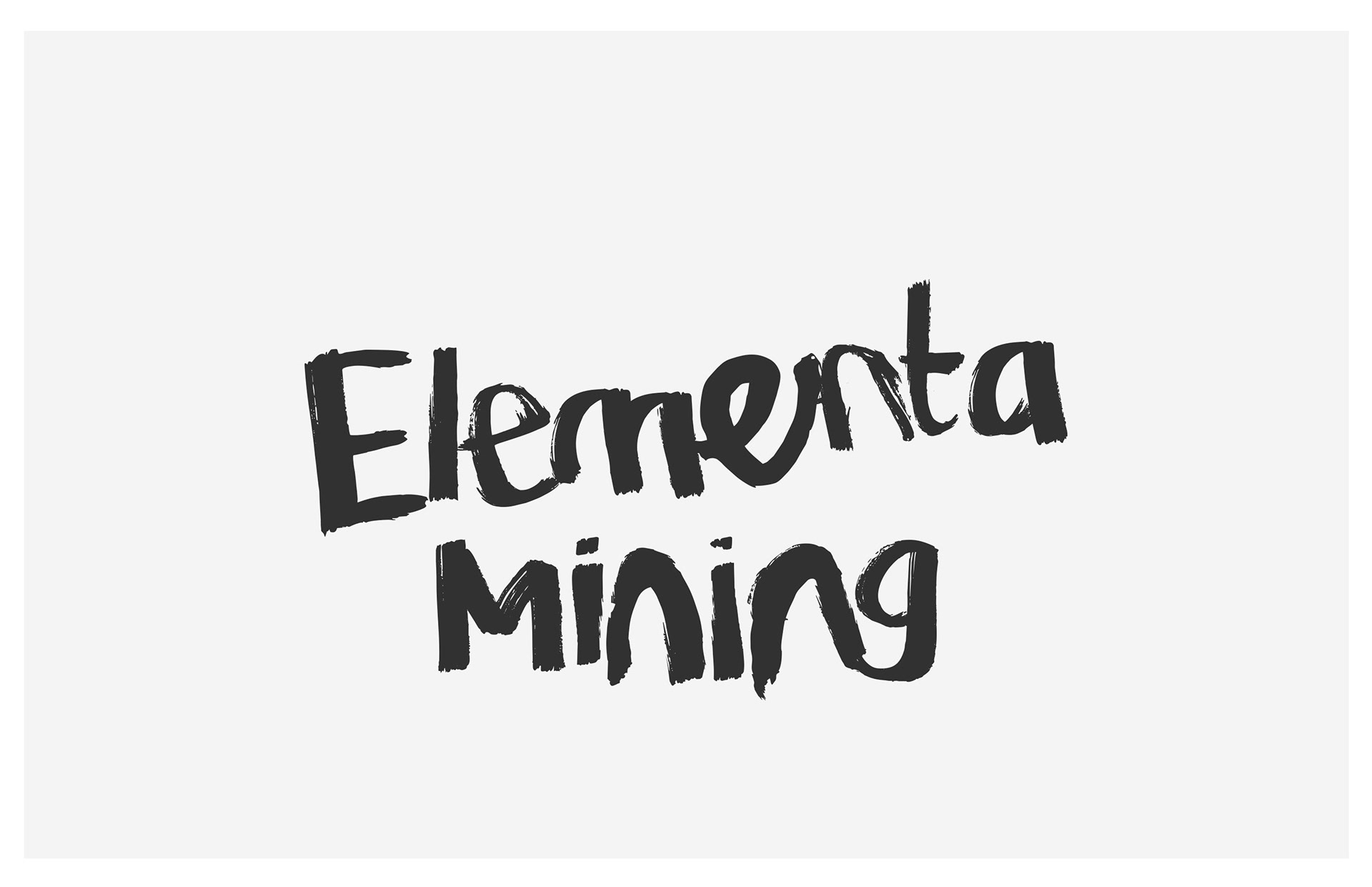
Elementa Mining
Brand Identity Concept
––
Elementa Mining operates in a sector where clarity, responsibility, and trust are essential. This identity was developed to support those priorities, moving away from familiar mining tropes in favor of a restrained, editorial-led system.
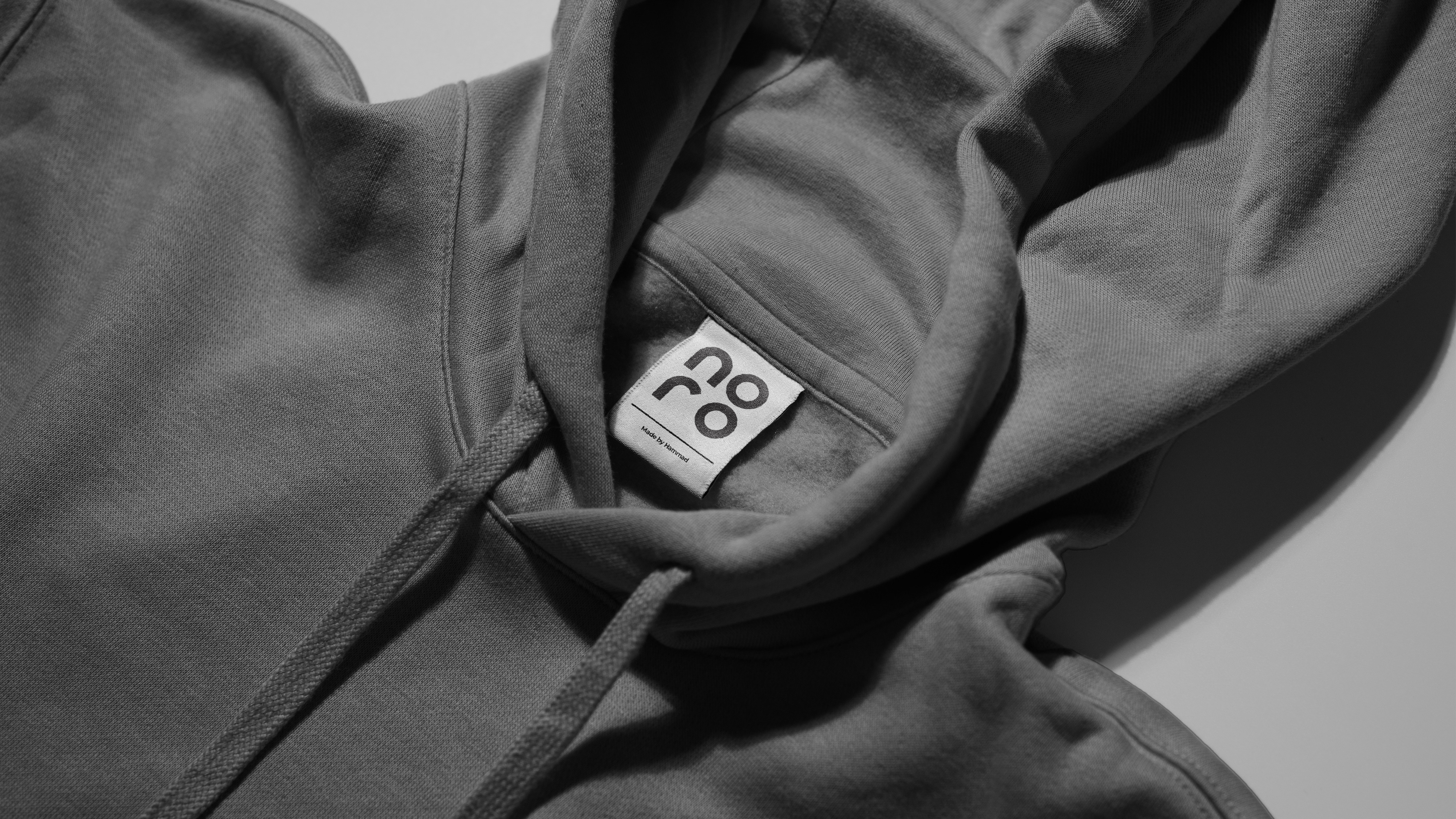
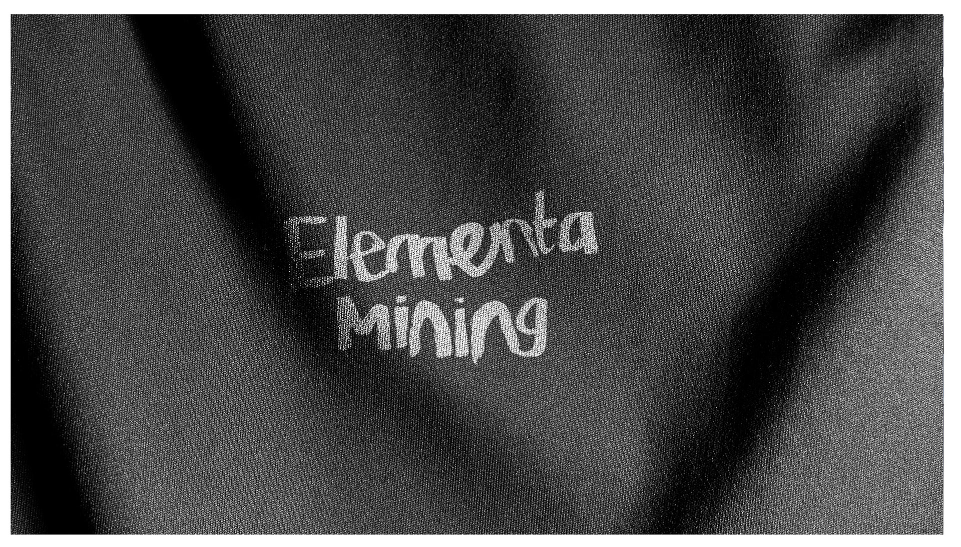
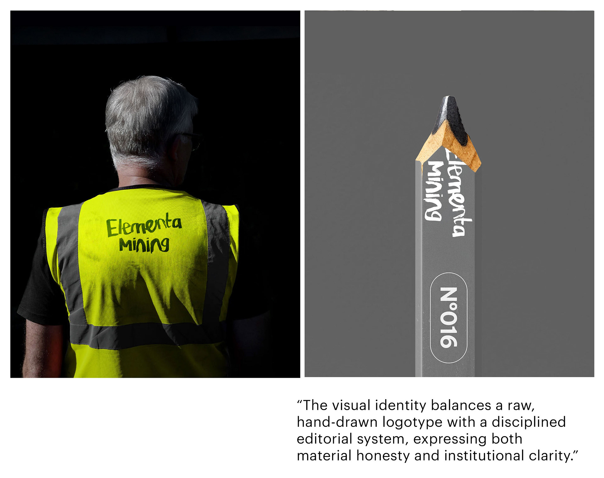
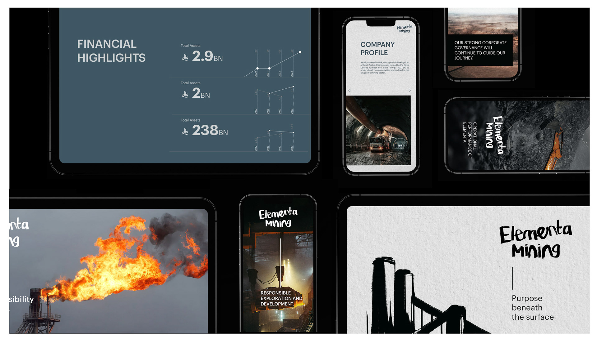
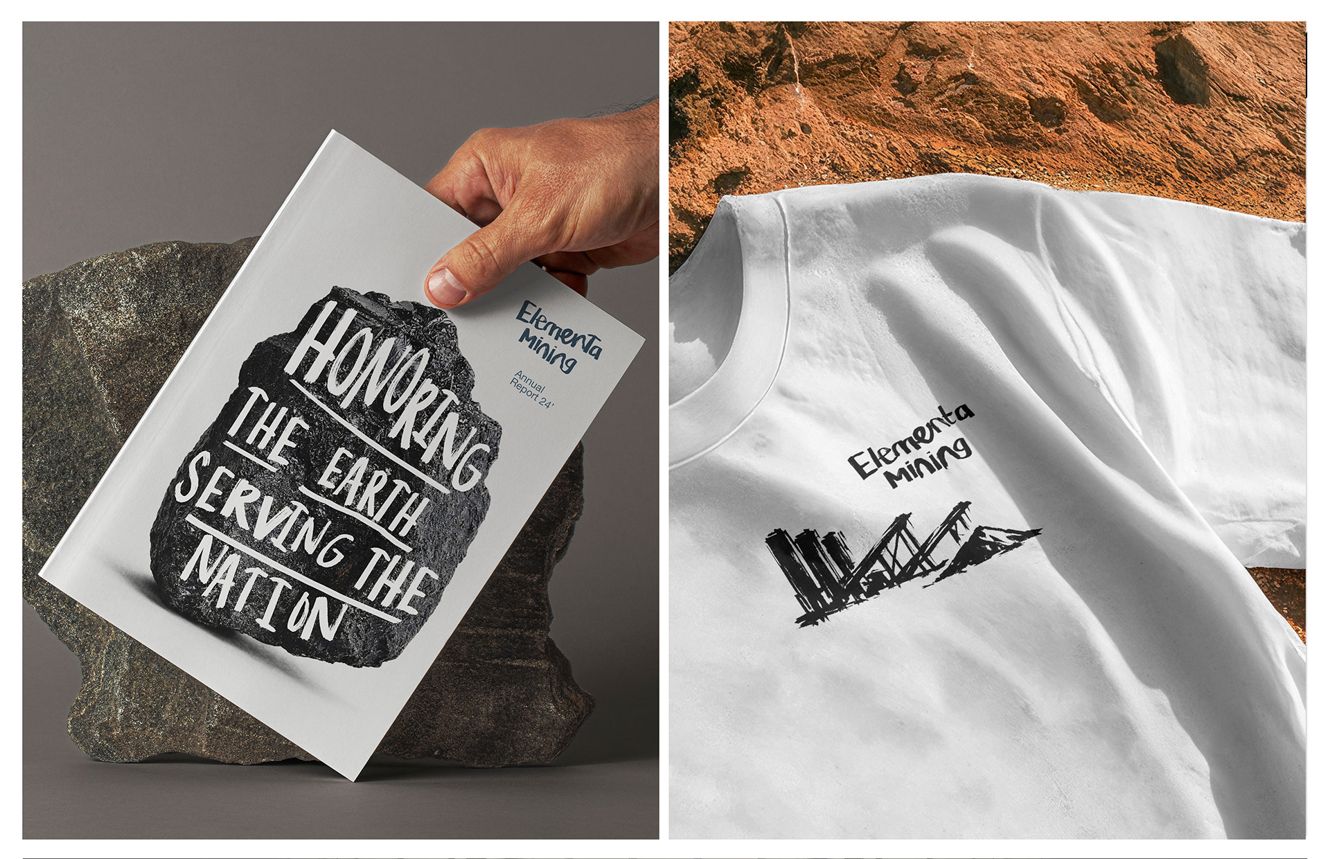
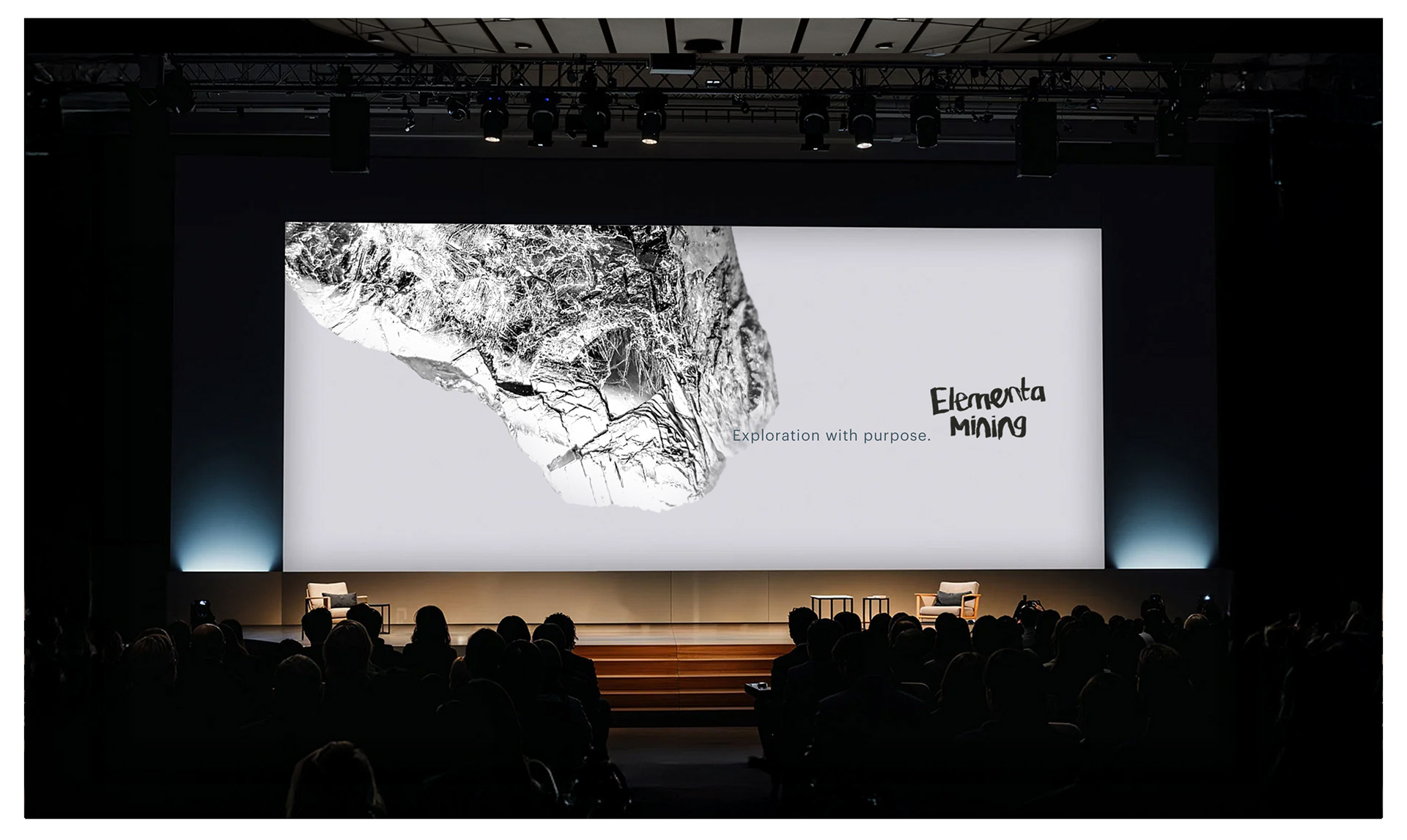
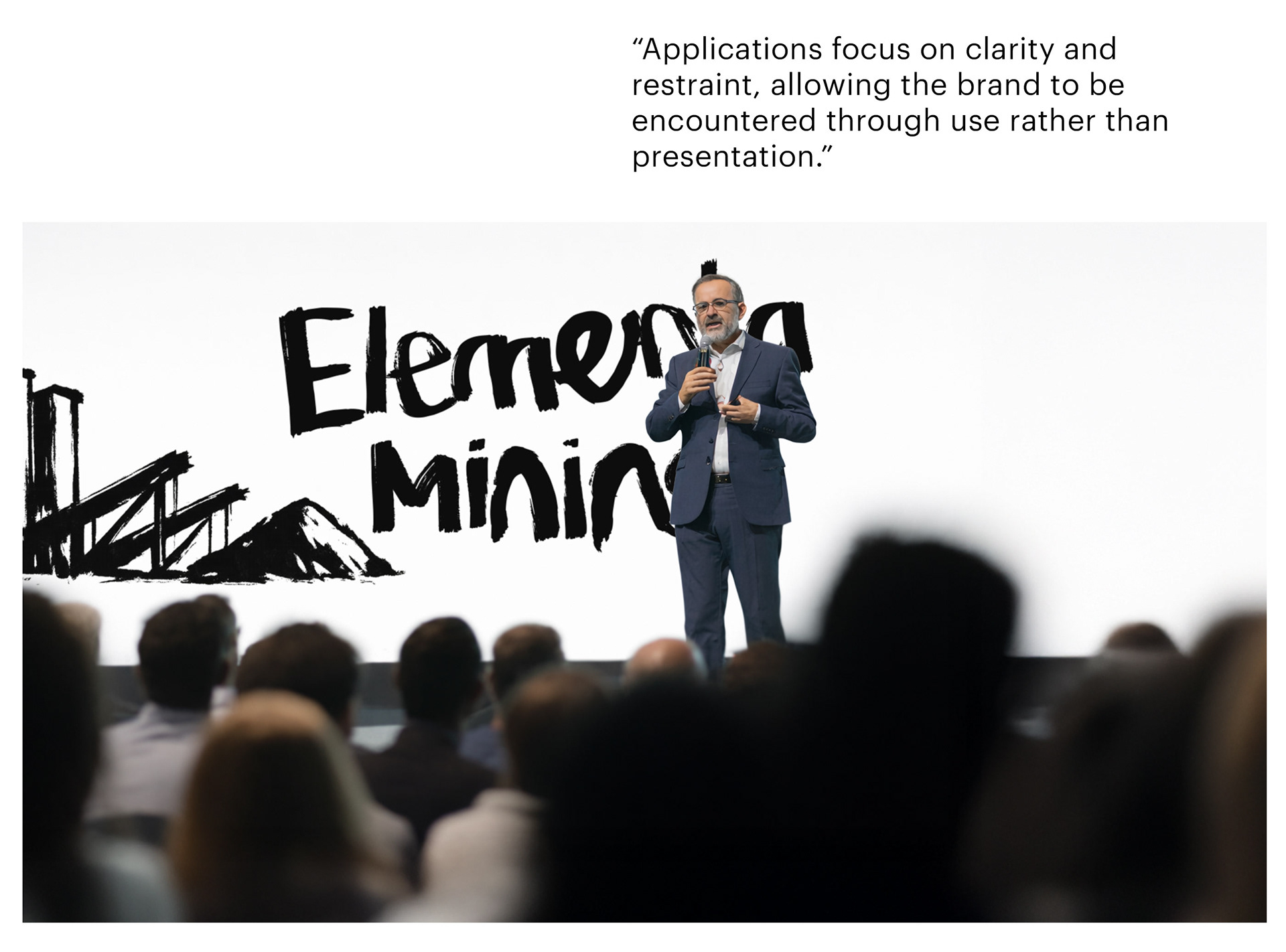
The identity is built around contrast. A raw, hand-drawn logotype introduces material honesty and human intent, while a disciplined typographic and layout framework provides structure and consistency across applications.
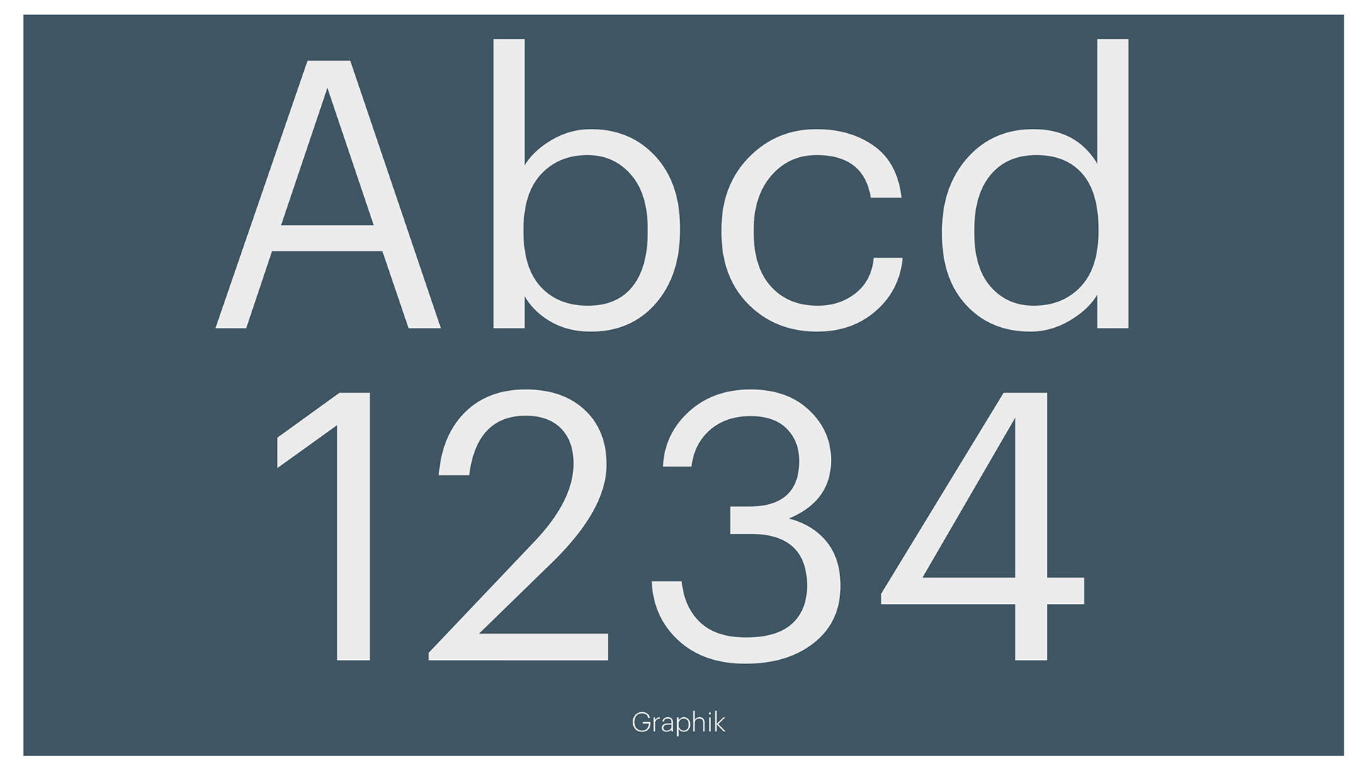
Graphik serves as the primary typeface, chosen for its neutrality and precision in long-form and information-heavy communication. The handwritten mark is used selectively, reinforcing purpose without becoming decorative.
The result is a calm, credible identity system shaped by restraint, clarity, and long-term thinking.

Overview
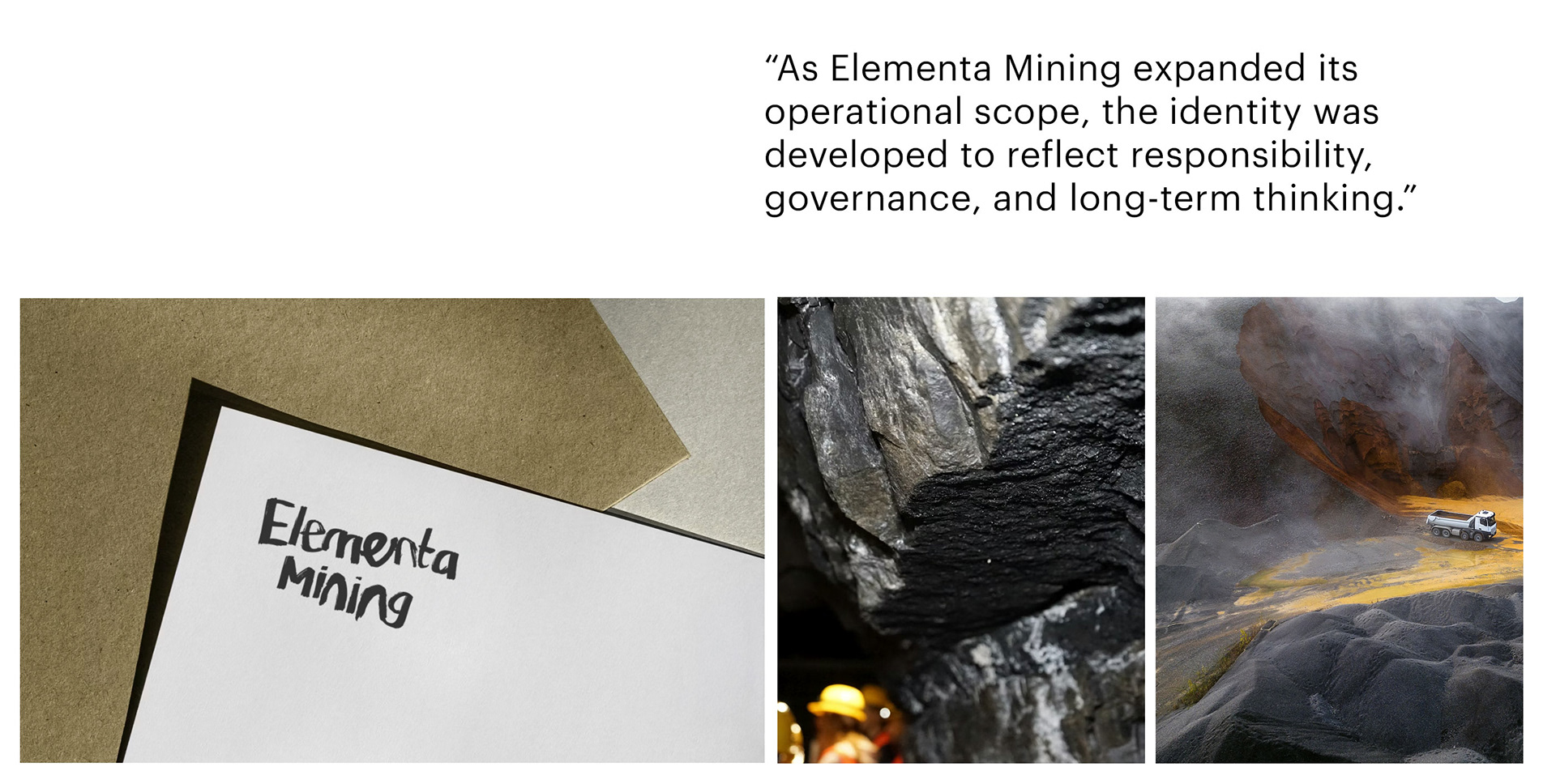
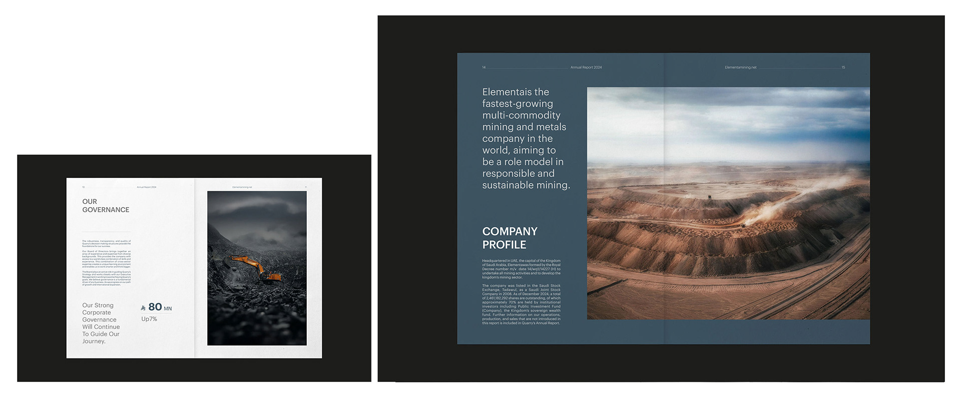
This branding system for Elementa Mining explores how a material-led industry can express clarity, responsibility, and long-term intent through identity design. The system is built to support everyday corporate and operational communication rather than act as a visual statement.
The focus is on structure, consistency, and restraint, allowing the brand to function confidently across different scales and contexts.
The challenge
The core challenge was balance.
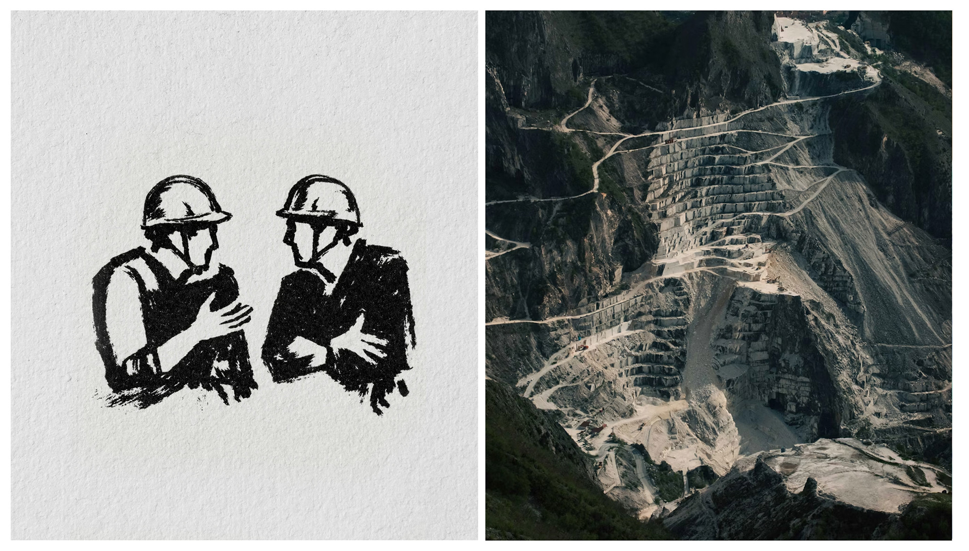
Mining identities often lean heavily on industrial symbolism or visual force. This project sought to avoid both. The task was to create an identity that feels grounded and human, while maintaining institutional credibility and authority.
Another challenge was durability. The system needed to work across documents, presentations, signage, and internal materials without becoming decorative, repetitive, or trend-driven.
The system
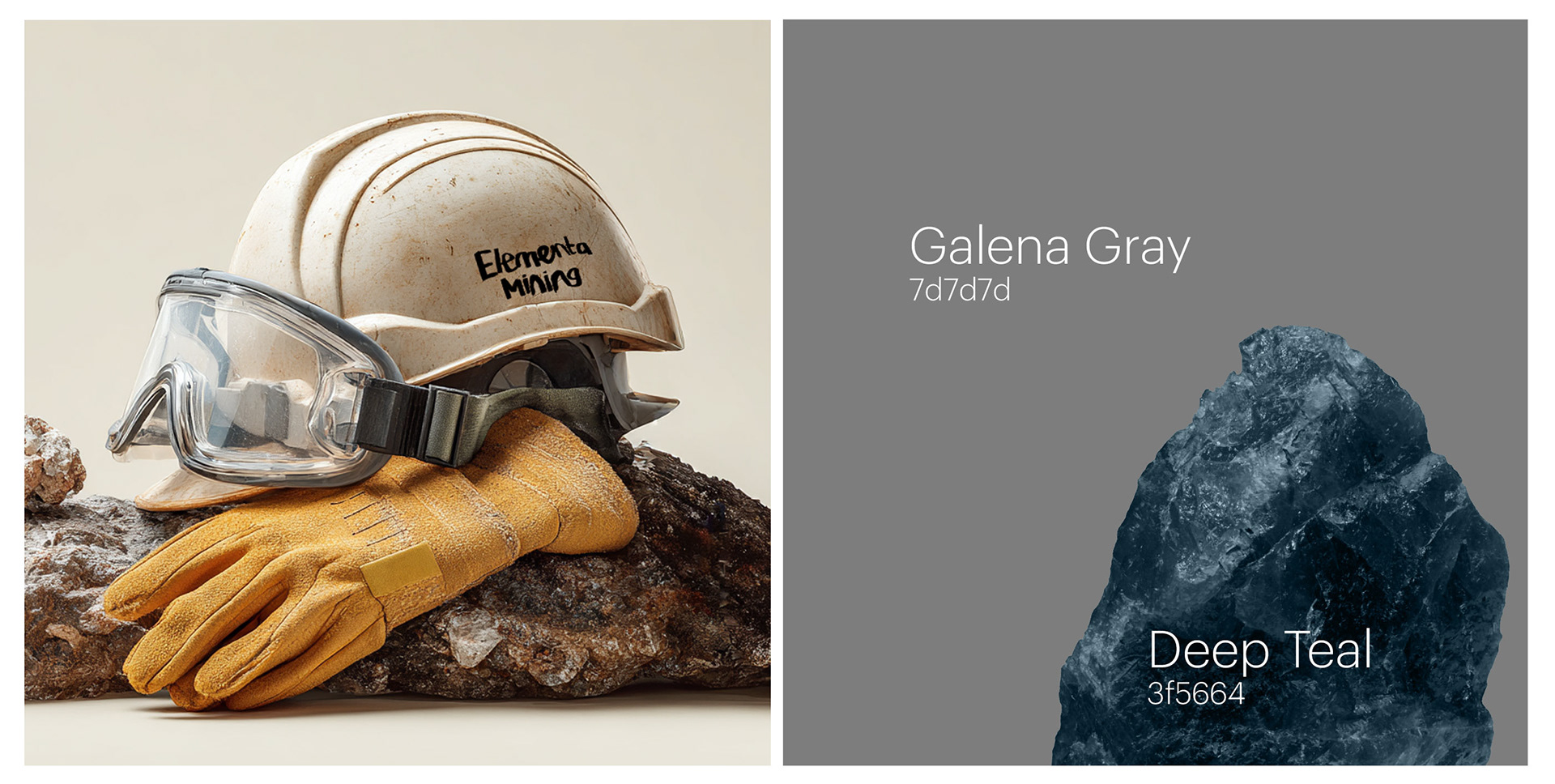
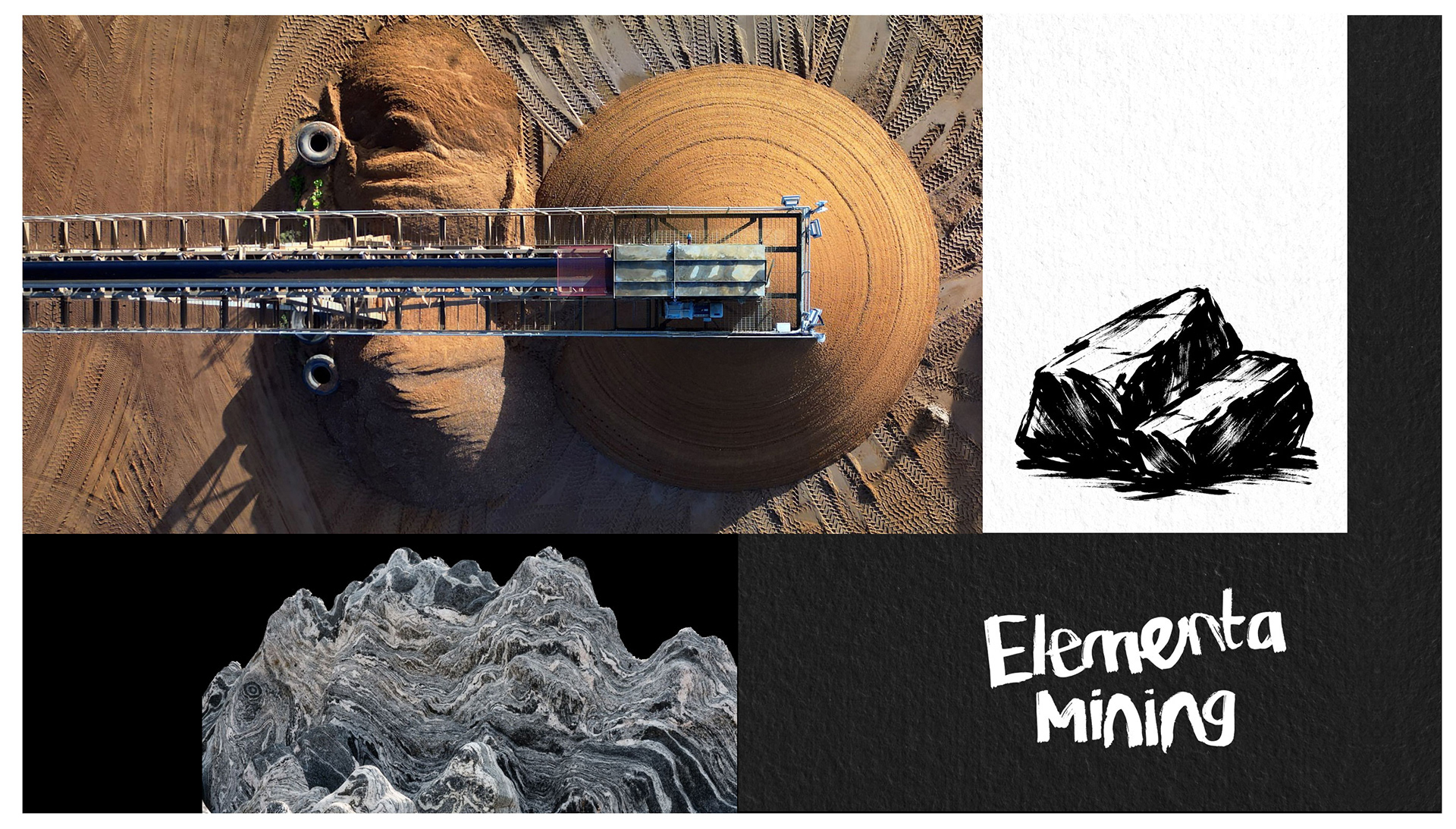
The identity is built around contrast.
A raw, hand-drawn logotype introduces material honesty and intent. Around it, a disciplined typographic and layout system provides clarity and control. Graphik serves as the foundation of the system, supporting information-heavy content with neutrality and precision.
Expression is introduced selectively. The system does not rely on pattern or repetition, but on spacing, hierarchy, and consistent application.
Outcome
The result is a branding system that feels calm, credible, and practical. It is designed to be encountered through use rather than explained through guidelines.
By prioritizing restraint and structure, the identity supports long-term communication and avoids visual noise, allowing the brand to remain clear and relevant over time.
Thank you for taking the time to view the project.