2025 Vol. 1: The Art of the Hook
There’s something really special about the moment when a story begins to take visual form.
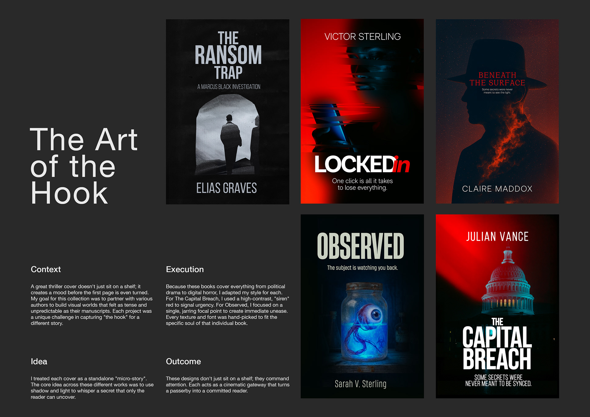
Over the past year, I’ve noticed myself returning again and again to the darker side of storytelling,
thrillers, noir, and those kinds of stories that keep you turning pages long after you should have gone
to sleep. This collection is my way of exploring that world.
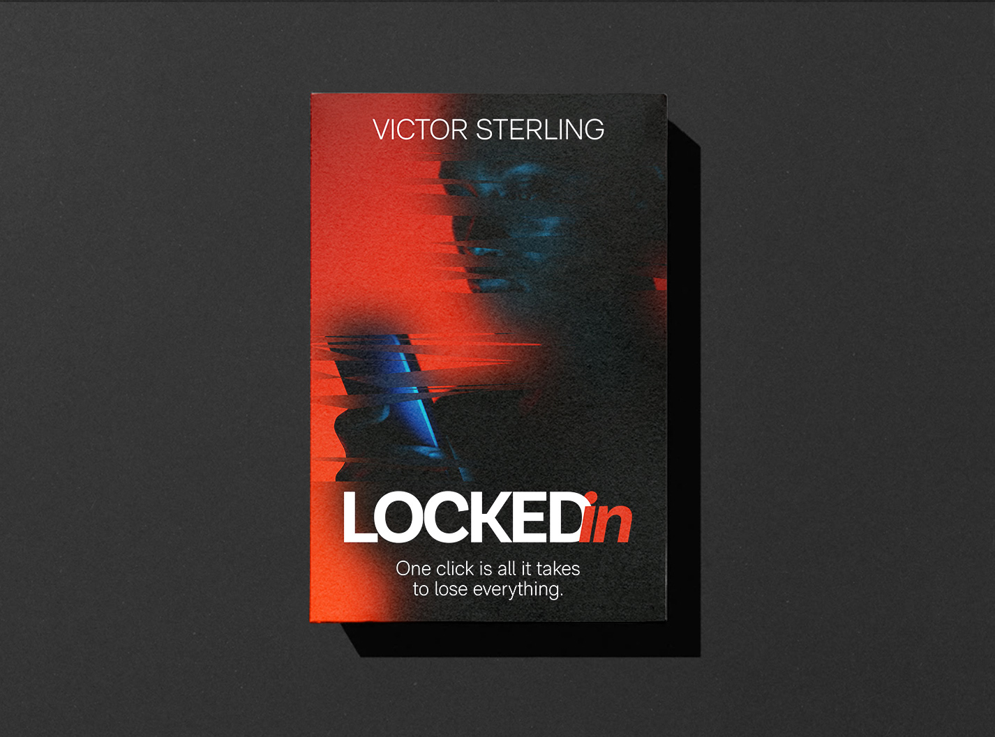
In another piece, the glitch effect represents that unsettling moment when a digital life begins to unravel.
It’s supposed to feel a little claustrophobic, like something is quietly going wrong.
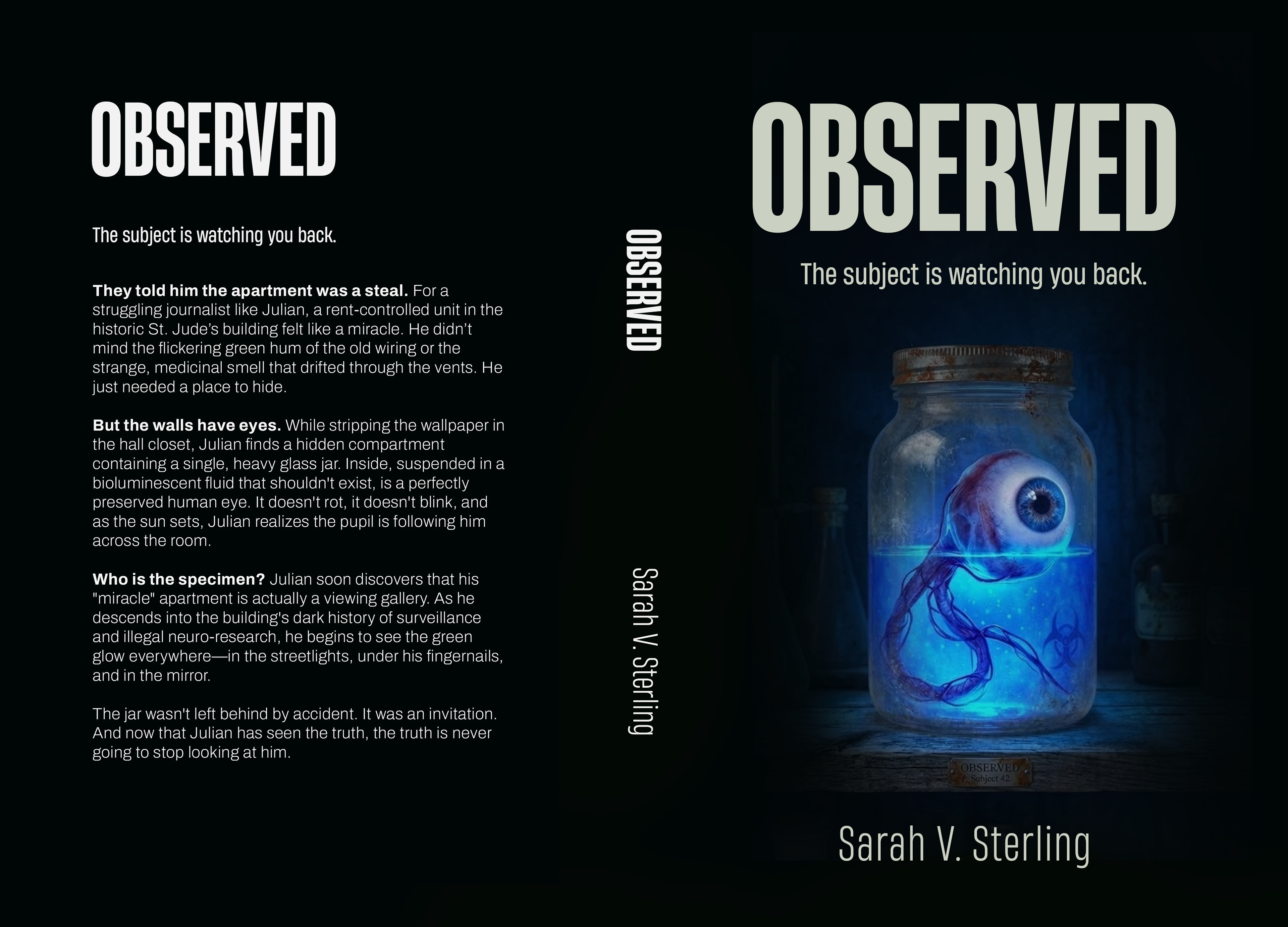
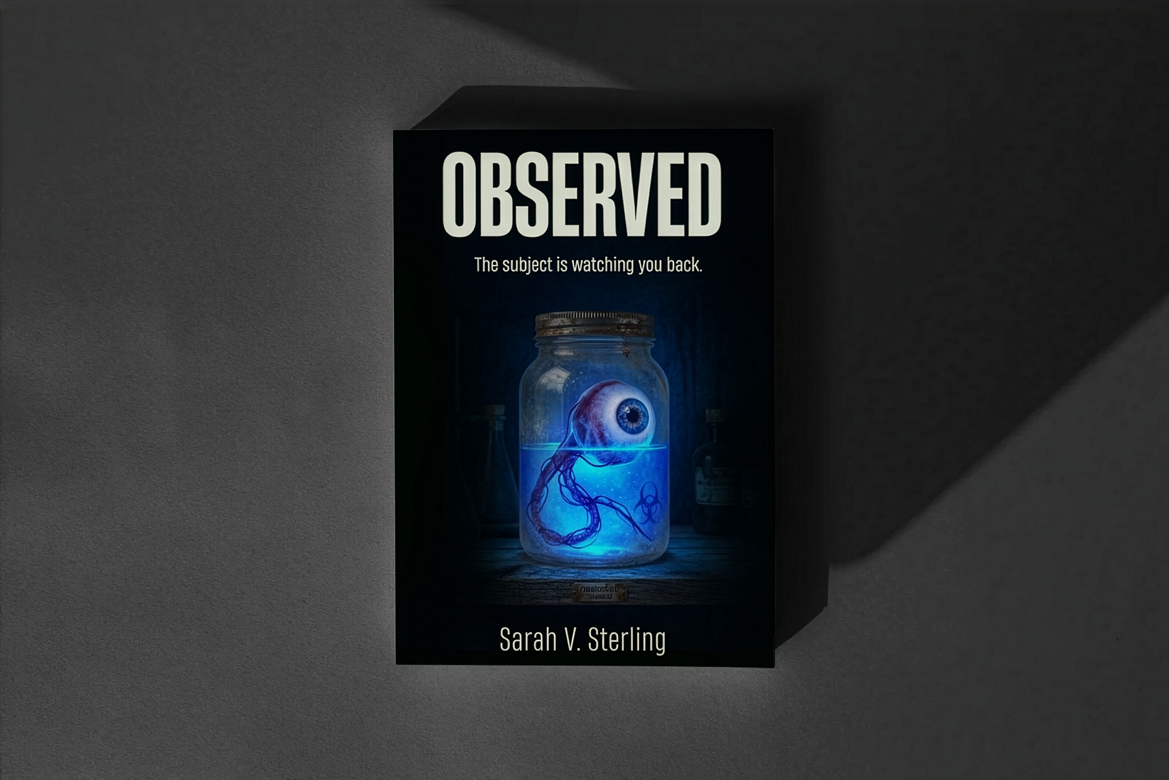
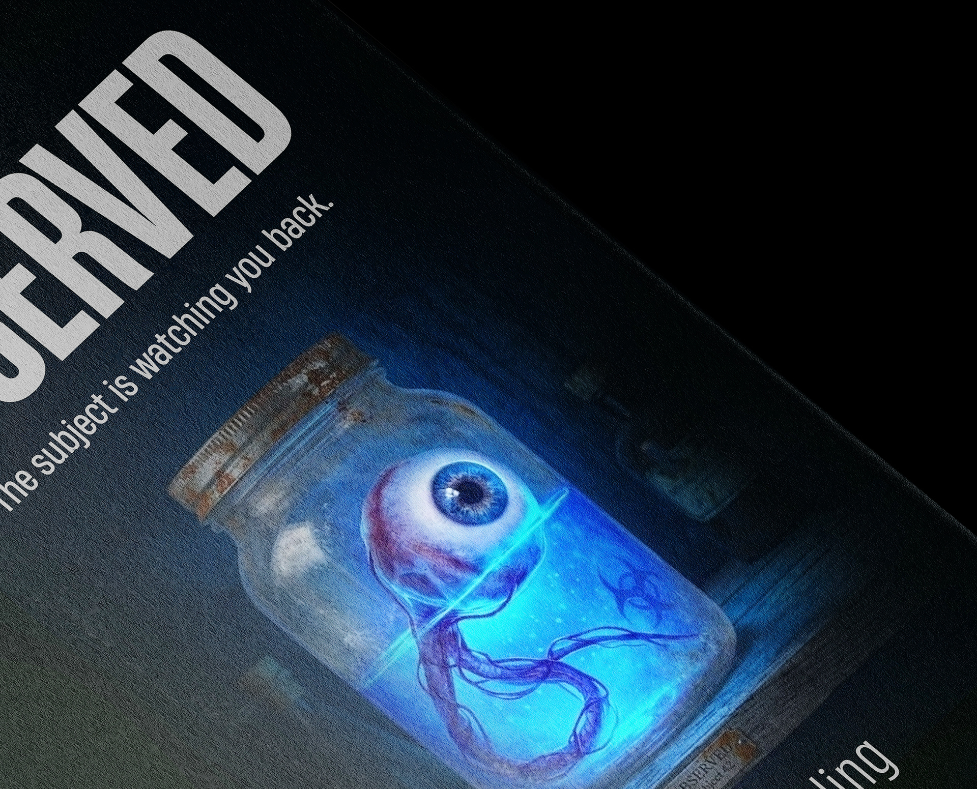
The intense, bioluminescent blue fluid emits a radioactive glow, casting a cold, chemical light over the decaying remains of a forgotten experiment.
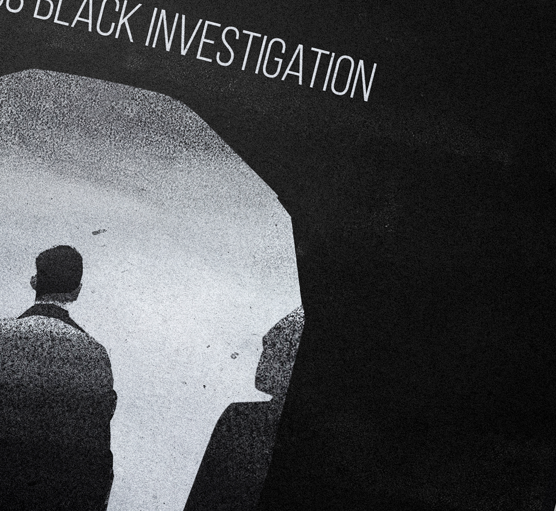
A nod to classic noir.
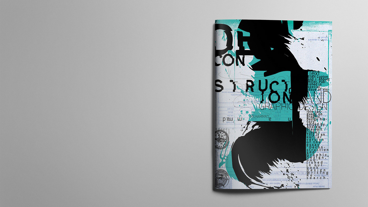
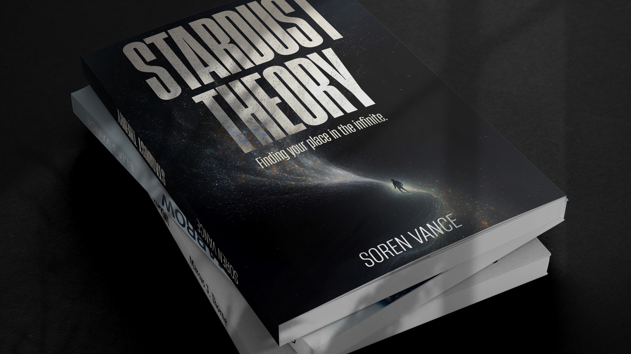
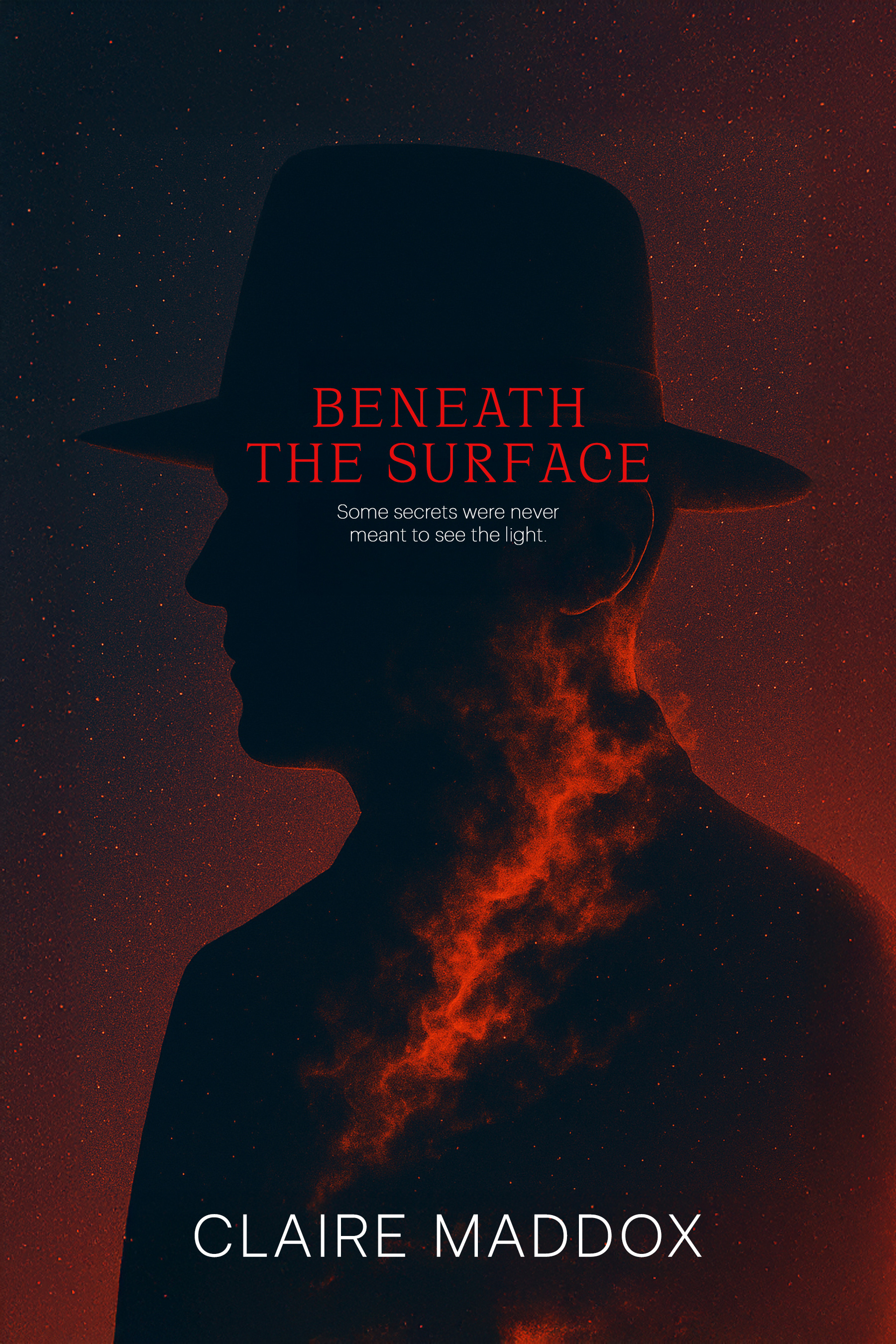
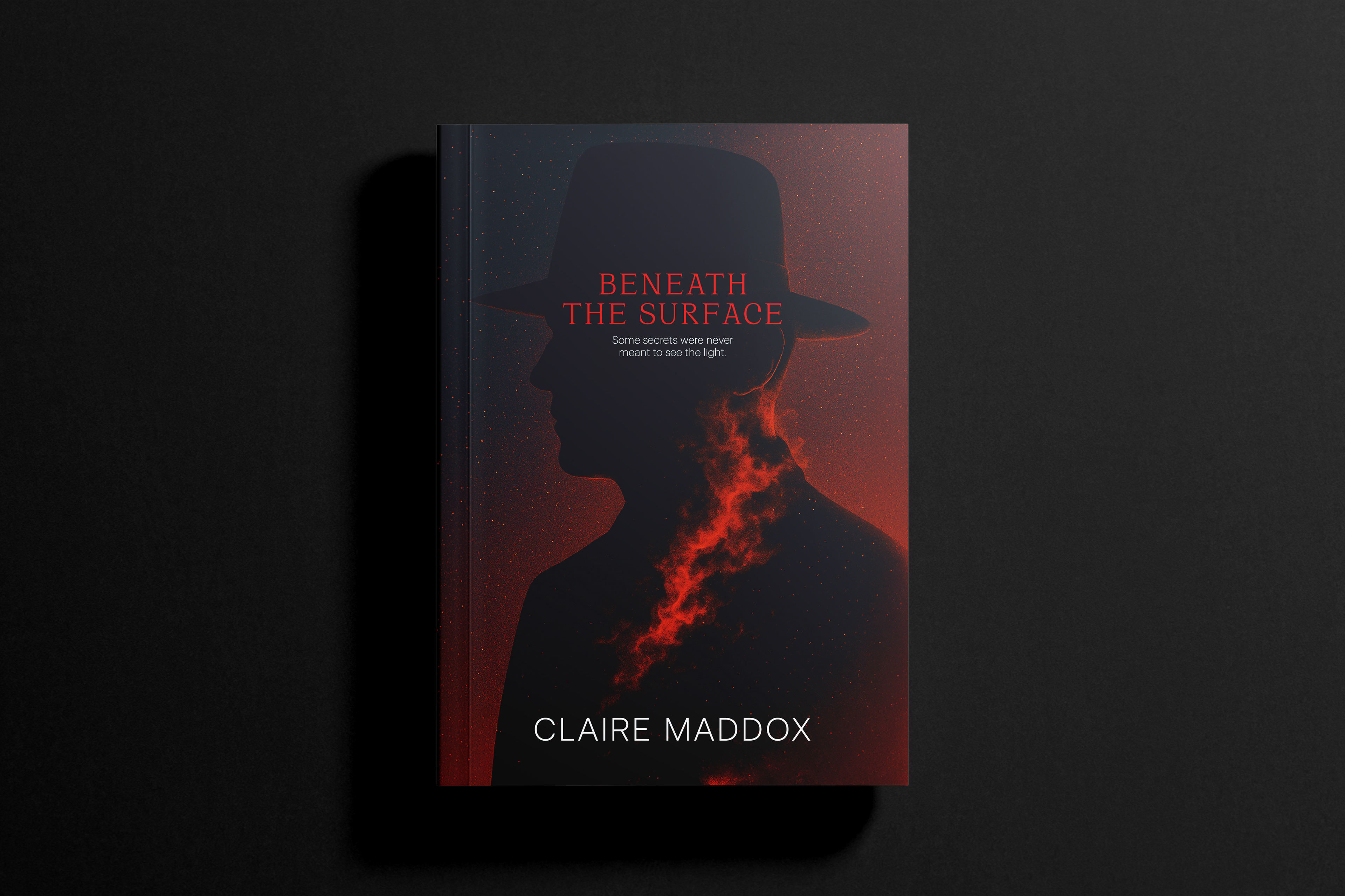
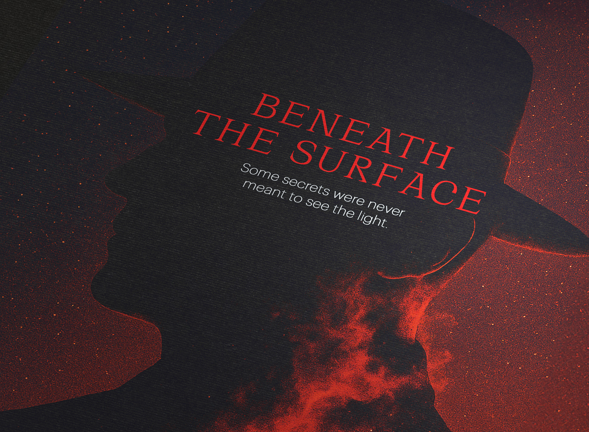
I kept the palette desaturated to let the lonely silhouette do the heavy lifting.
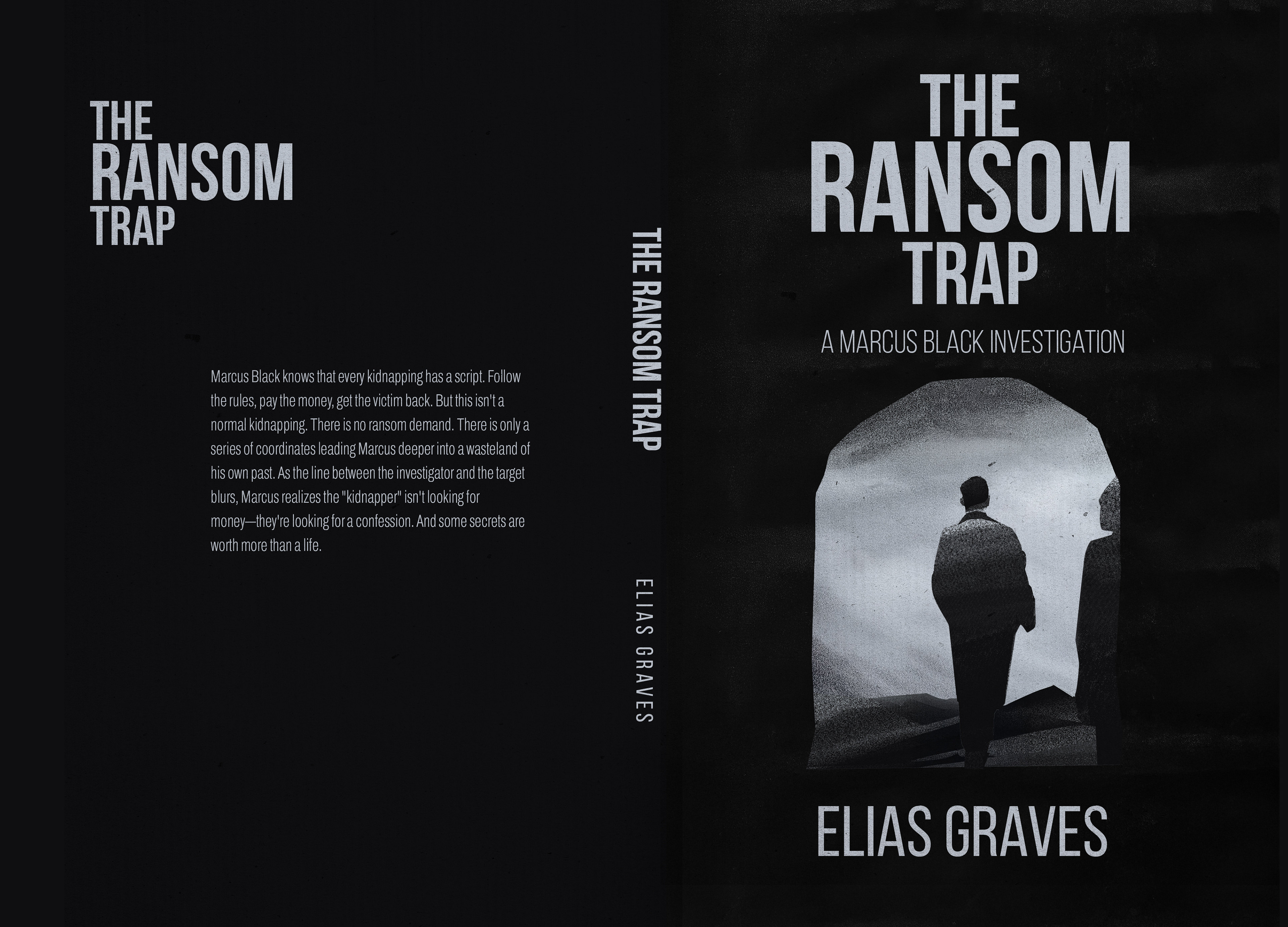
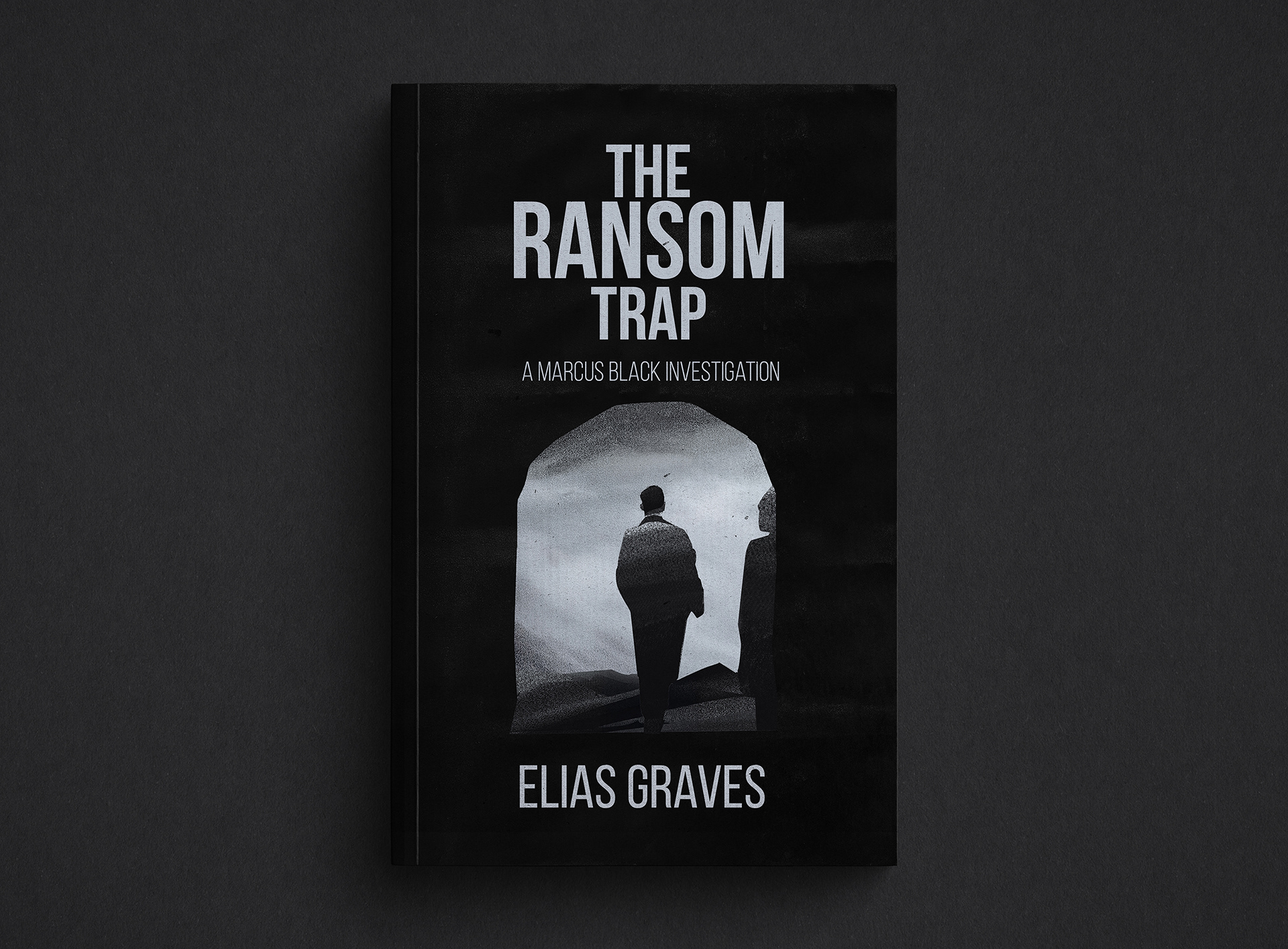
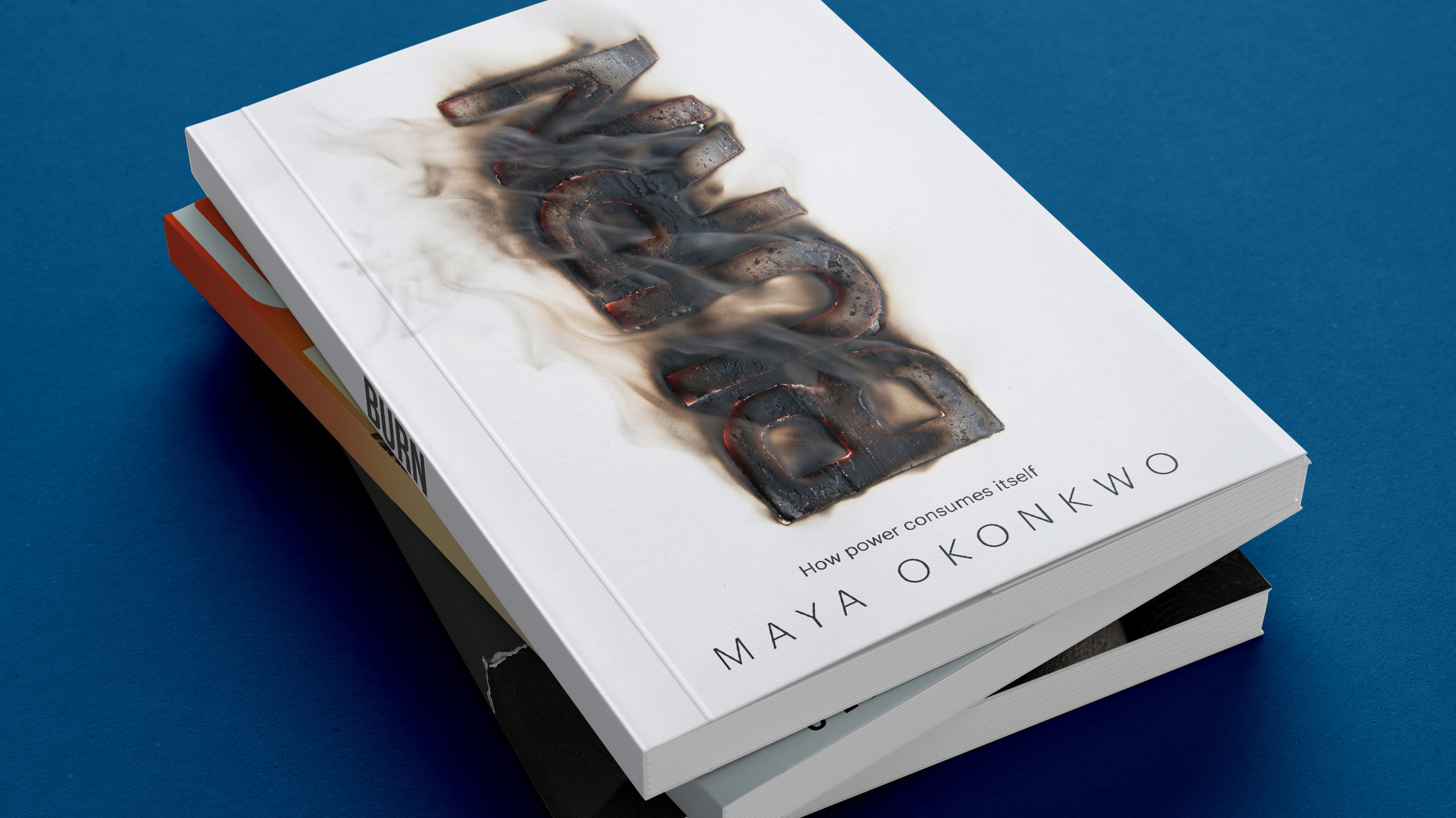
The fire-like texture rising from that silhouette was my way of suggesting that secrets never stay buried eventually, they burn their way into the light.
For me, a great cover isn’t just about making something look nice.
It’s about capturing that feeling in your stomach during a tense chapter that subtle anxiety that keeps you hooked. Whether it’s the glitchy neon tension of Locked In or the quiet, eerie mystery of Beneath the Surface, each design became an exercise in telling a full story without a single line of text.
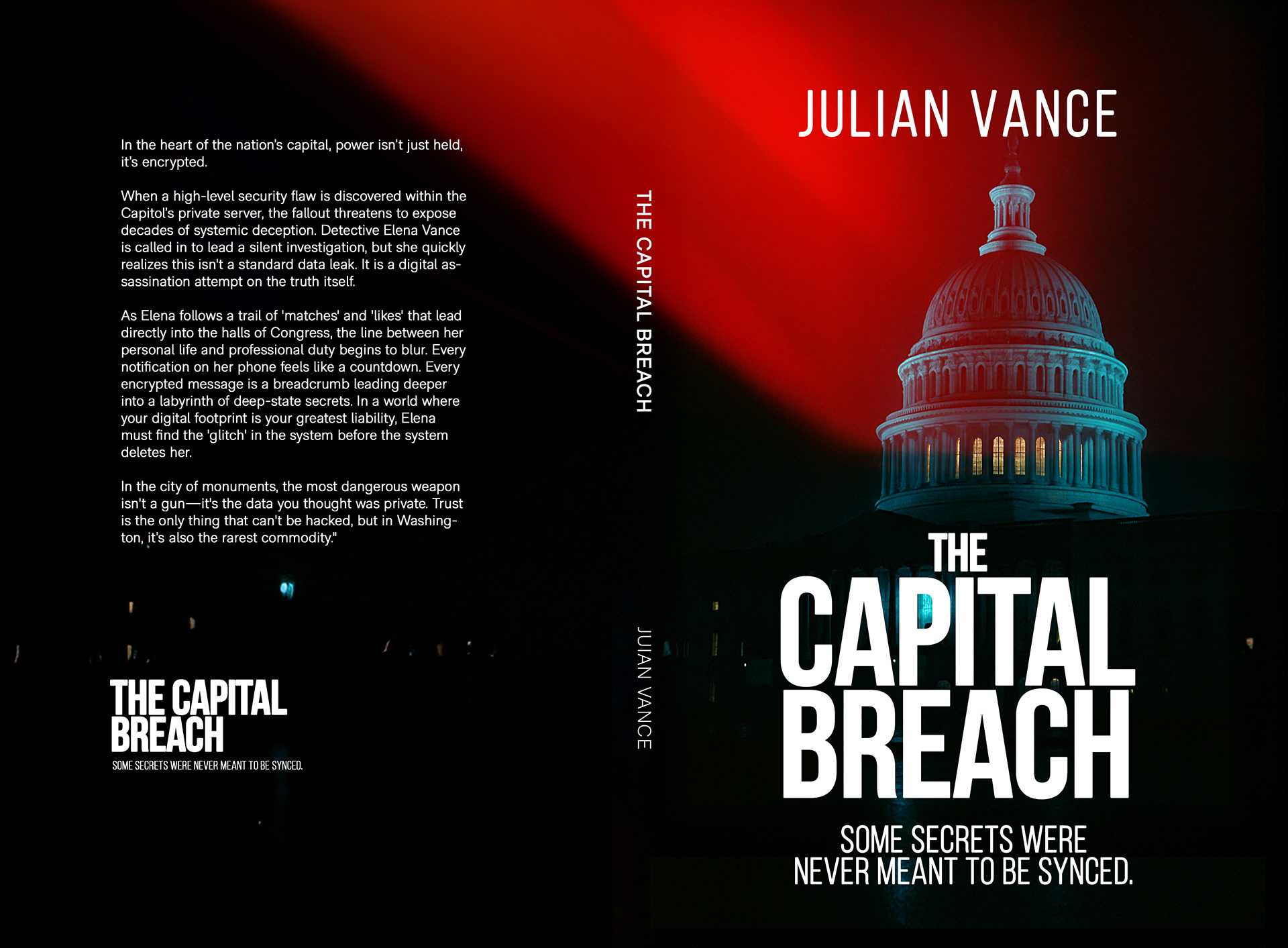
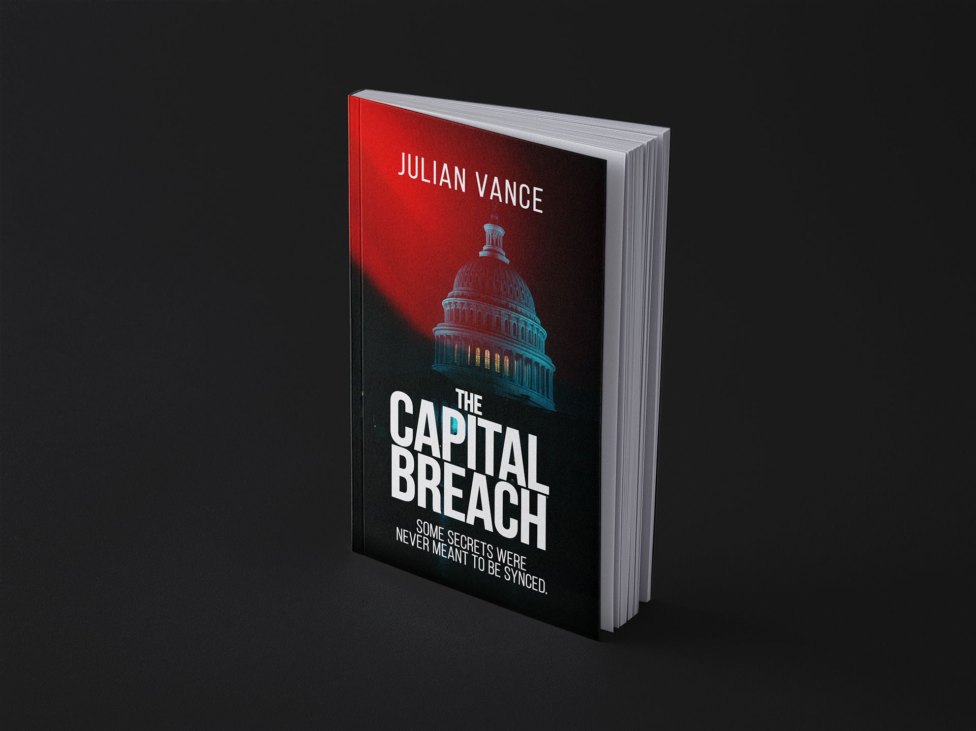
I leaned into bold visual tension.
The high-contrast red light, for example, was meant to feel like a warning siren,
immediate, urgent, almost political in its intensity.
Thanks for scrolling!
I’m currently taking on new book cover projects for 2026. If you have a story that needs a face, or just want to talk about design, feel free to reach out.
Let’s connect: