Elementa Mining. © 2026
Elementa Mining — Annual Report Design Concept
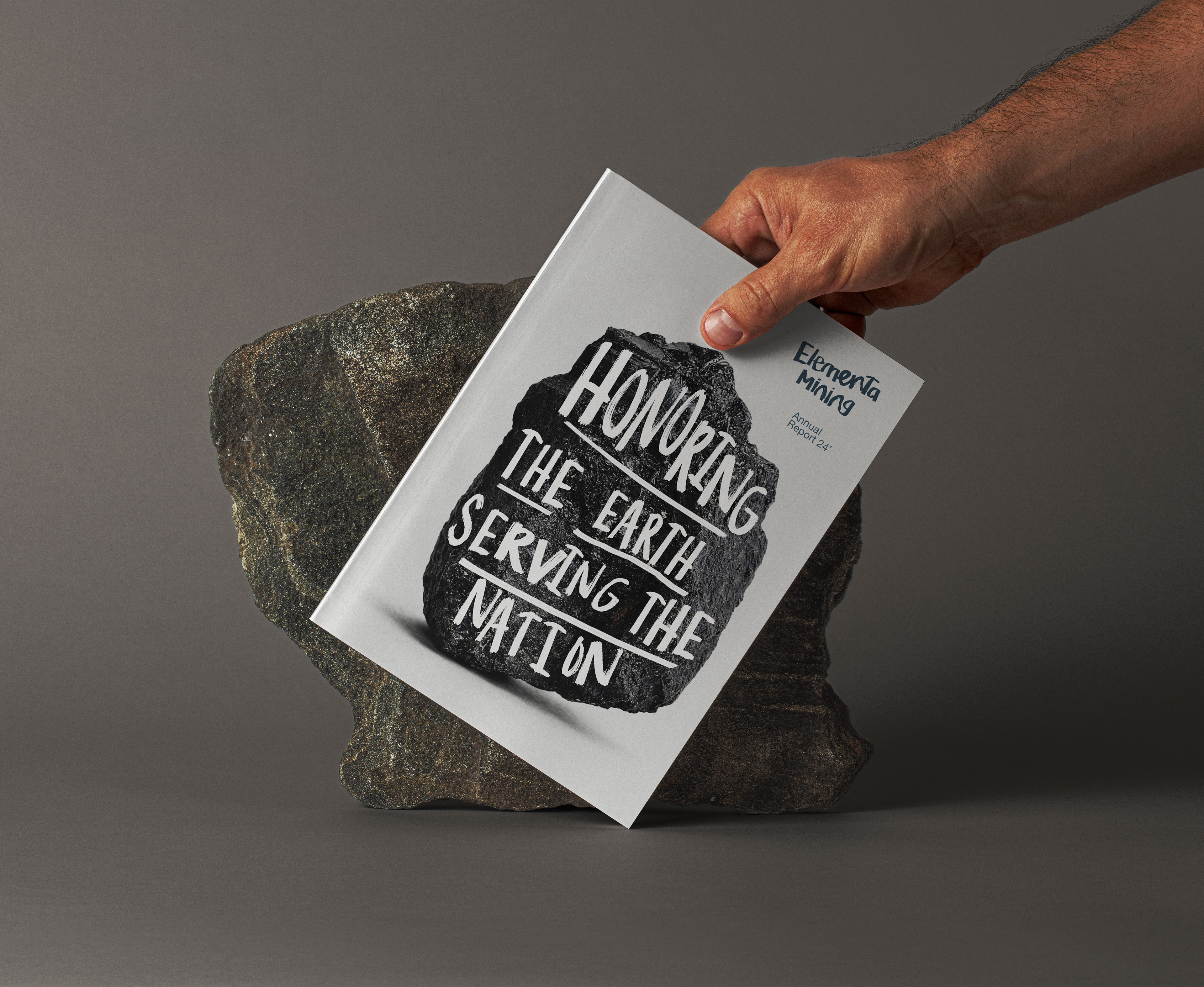
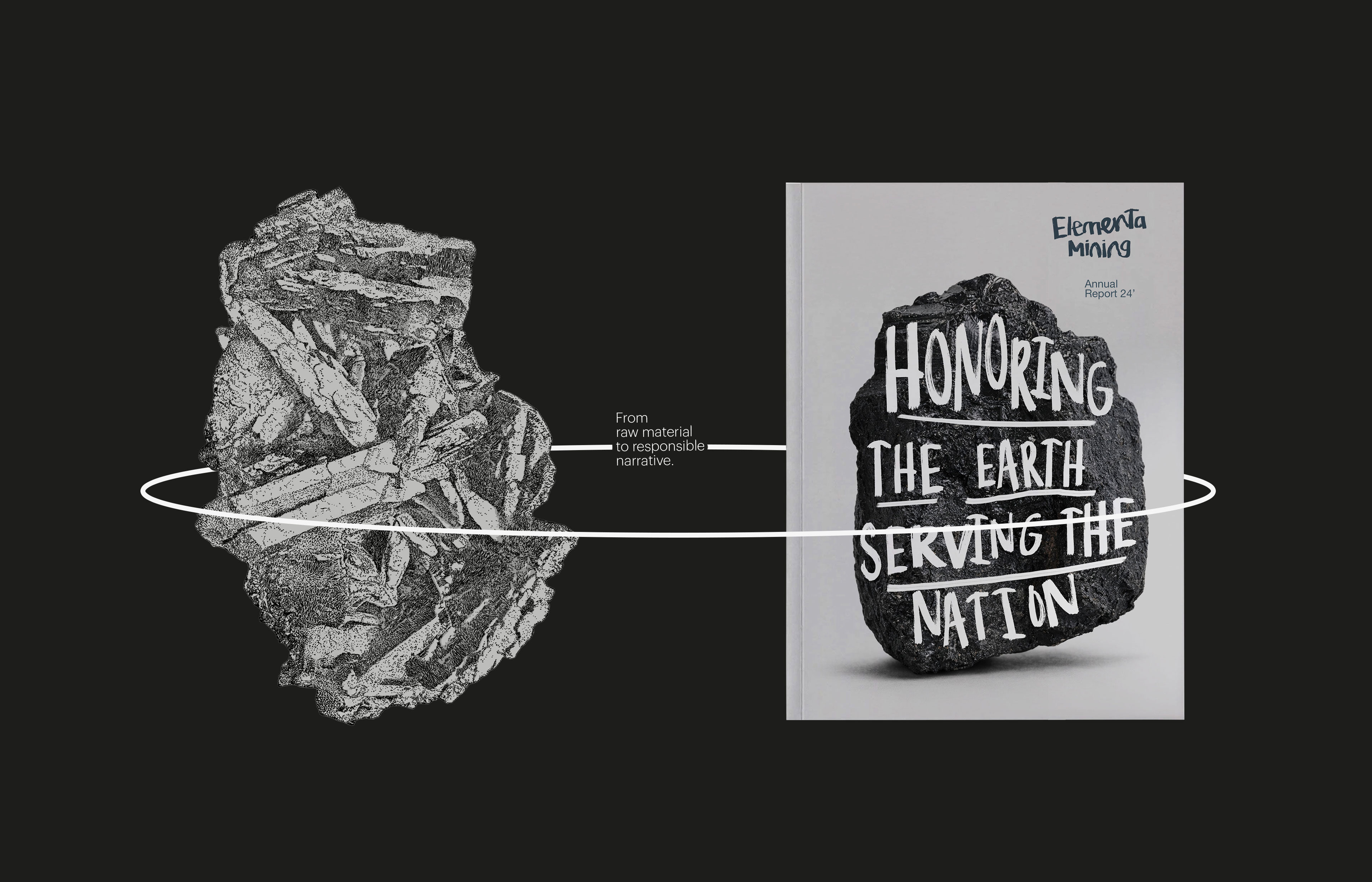
Honoring the Earth. Serving the Nation.
Honoring the Earth. Serving the Nation.
_
This conceptual annual report explores how a modern mining company can communicate sustainability, governance, and national responsibility through restraint rather than visual excess.
The project reframes mining as stewardship. A disciplined editorial system, calm layouts, and material-focused imagery are used to support long-term thinking, transparency, and institutional credibility across the report.
Overview
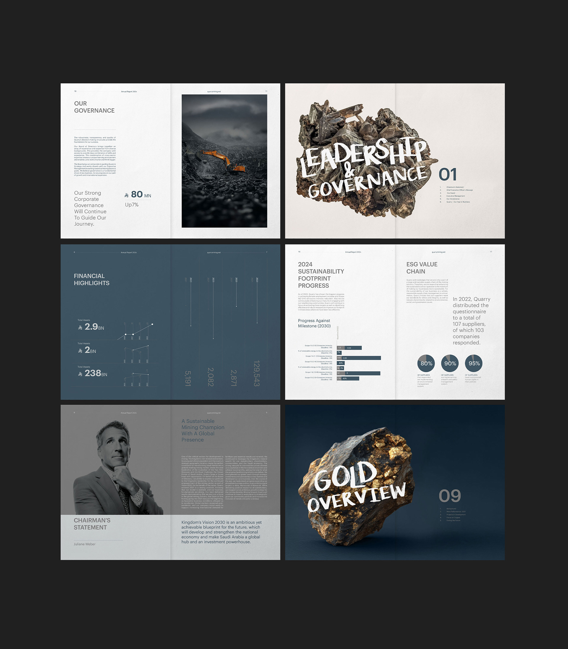
This annual report concept for Elementa Mining began with a simple concern. Mining communication often swings between technical overload and empty symbolism. I wanted to find a quieter, more grounded middle space.
The aim was to step away from familiar mining visuals and build a composed narrative around sustainability, governance, and national responsibility. The report approaches mining not only as extraction, but as stewardship.
–
Concept and narrative
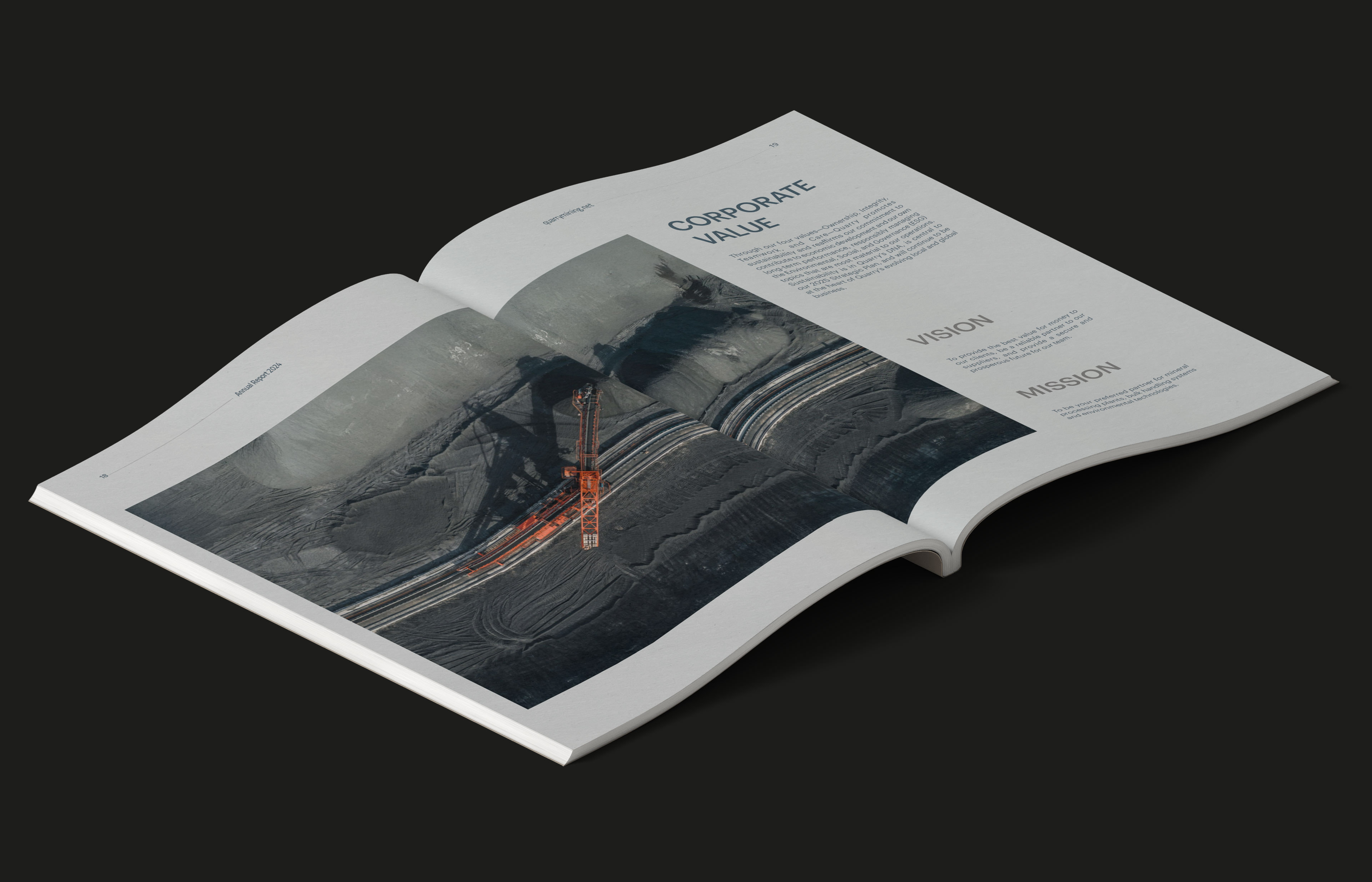
The core idea is Honoring the Earth. Serving the Nation.
This line sets the tone from the first page. It acknowledges the reality of working with natural resources and the responsibility that comes with it. There is no attempt to dramatize or soften the subject. The message is direct and deliberate.
The supporting line, Exploration with purpose, runs through the report as a quiet anchor. It frames the work without explaining it too loudly and allows the content to carry the meaning.
–
Visual language
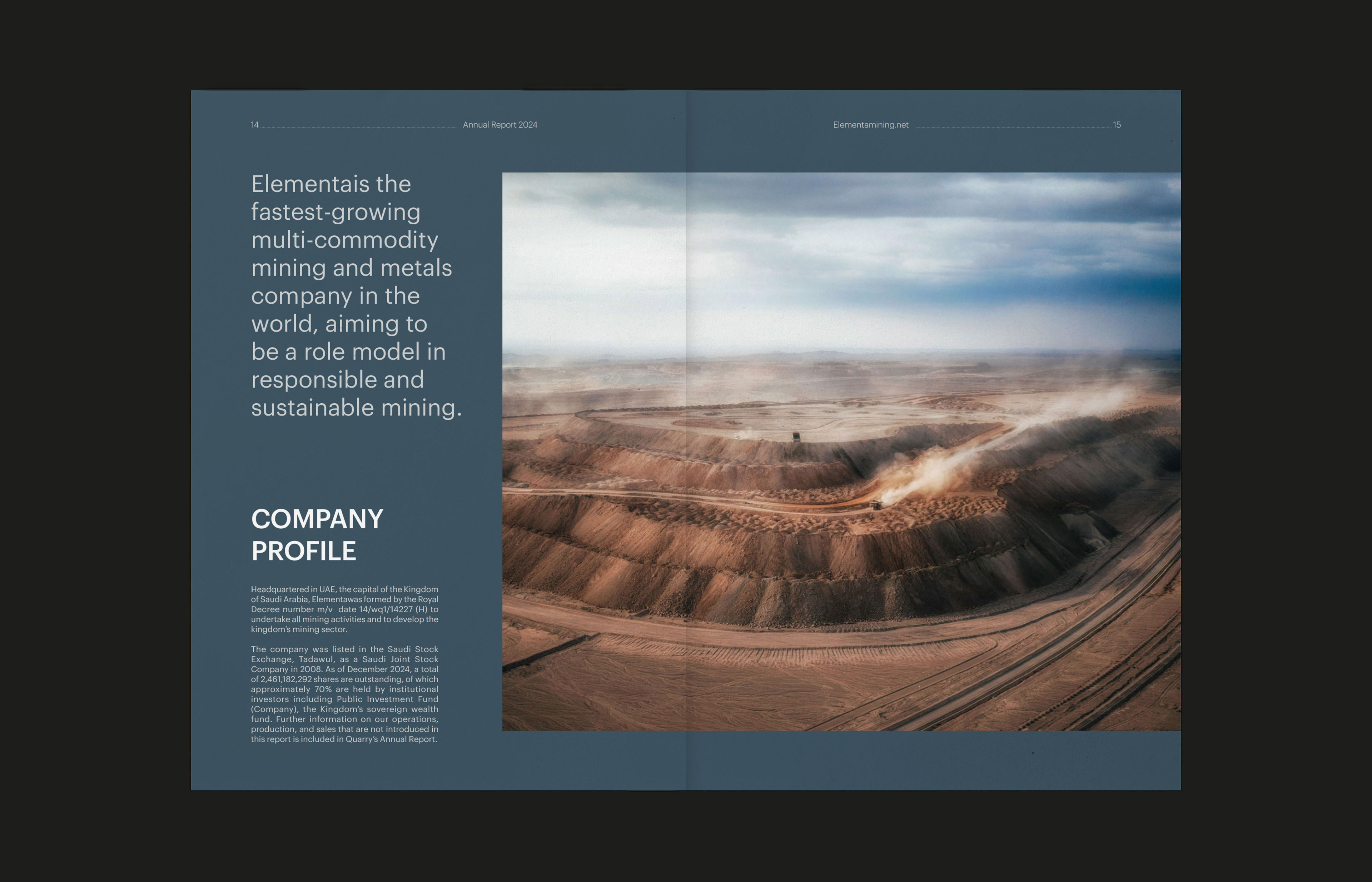
The visual language is built on restraint and contrast.
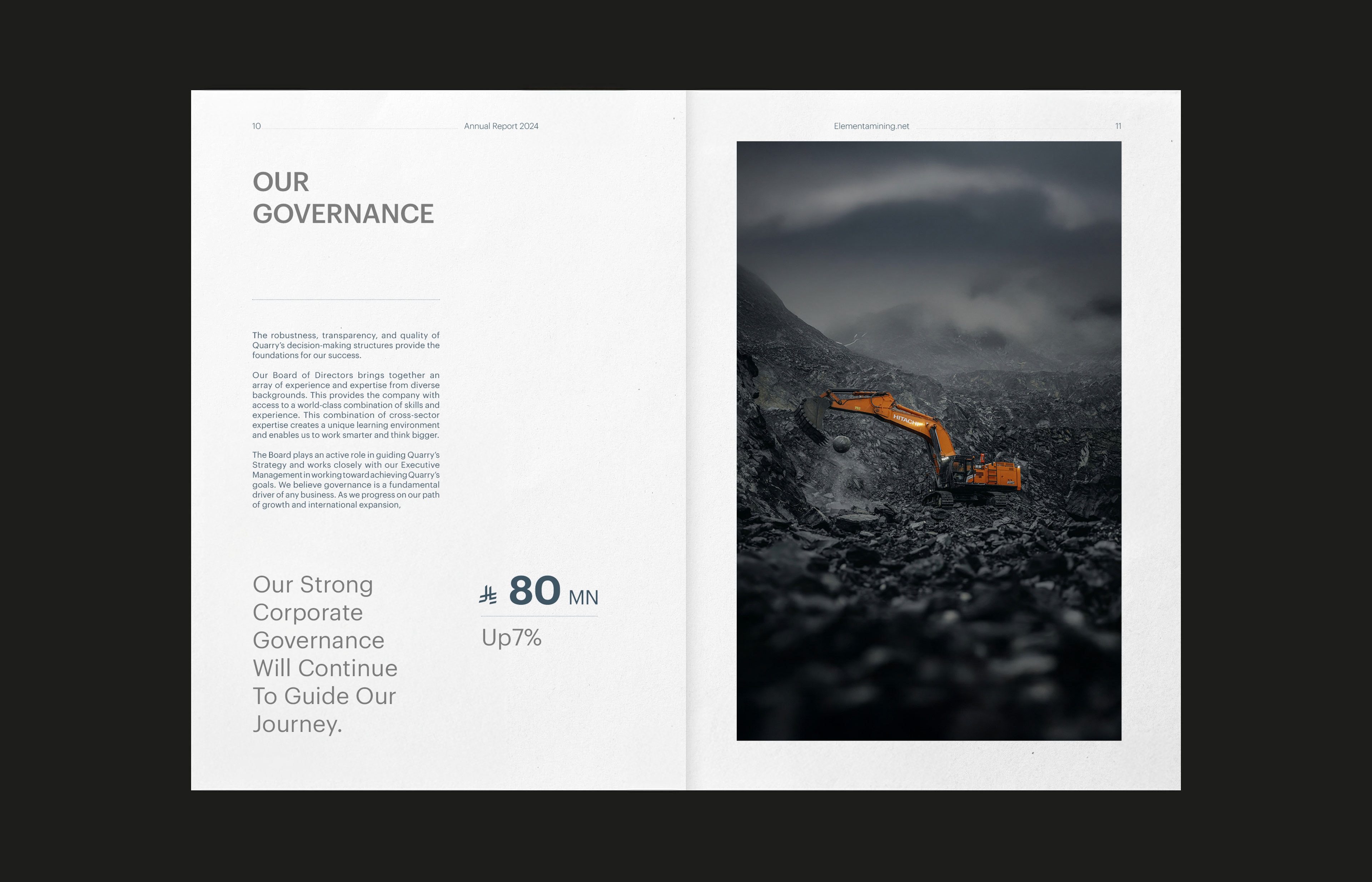
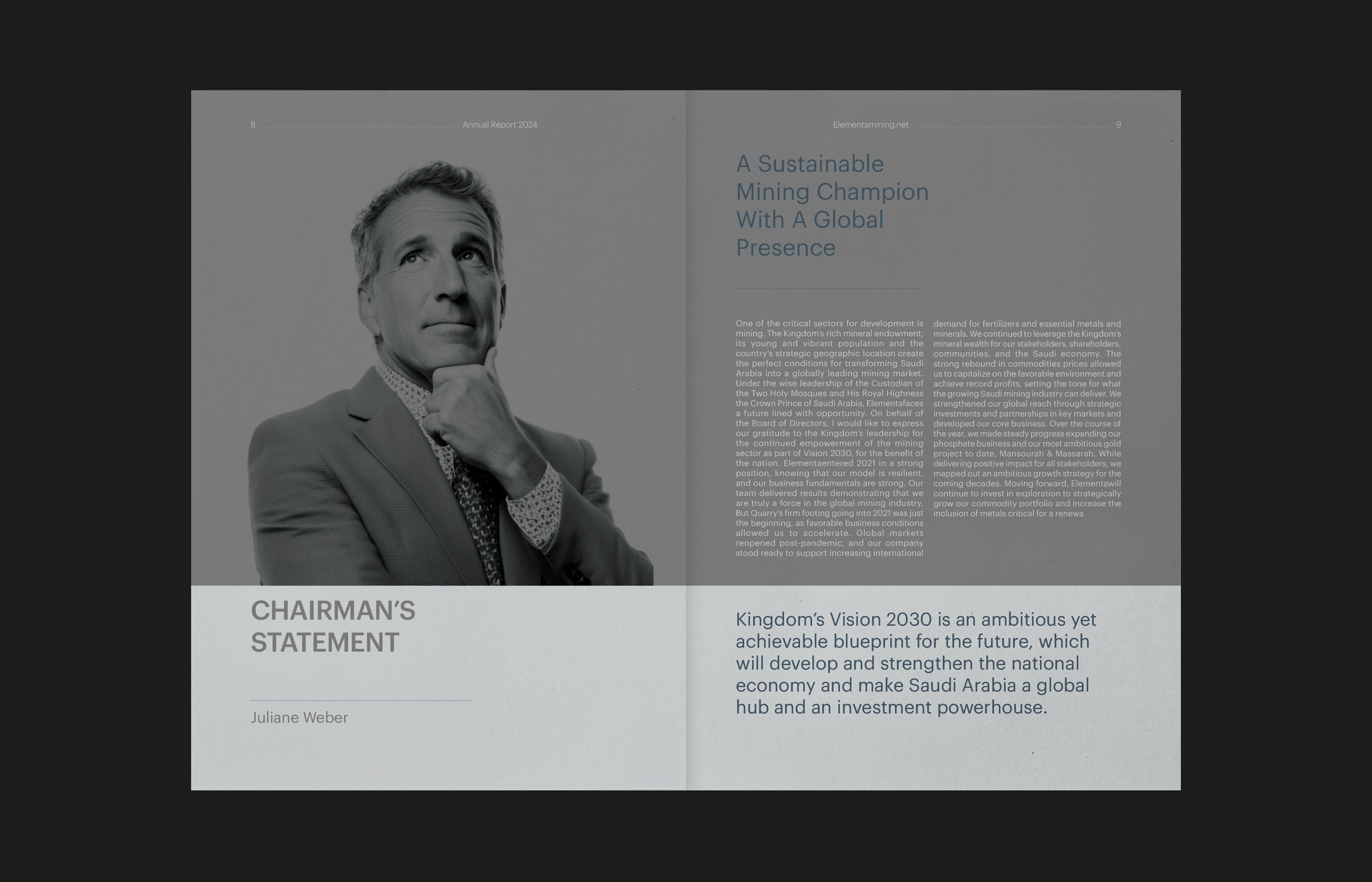
Raw imagery of minerals, quarries, and operations is paired with structured layouts, generous white space, and controlled typography. That balance reflects the nature of mining itself. Physical and material-driven, yet precise and disciplined.
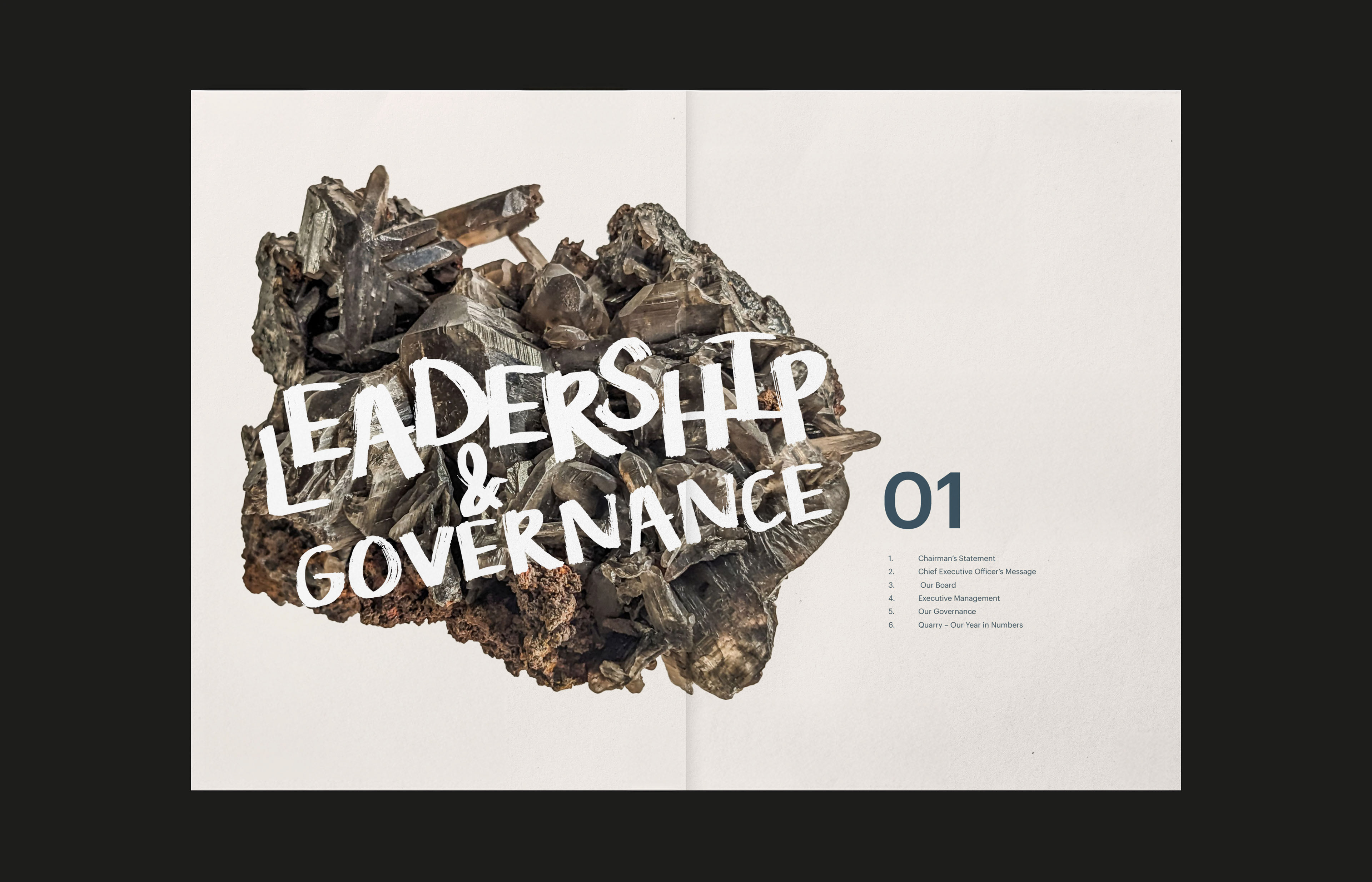
Graphik was chosen as the primary typeface for its clarity and neutrality. It provides a stable, institutional foundation and keeps the focus on structure and information.
This is contrasted with a hand-drawn typographic layer taken directly from the logo. Used sparingly on section openers and imagery, it introduces a human and material quality. It reflects the company’s vision in a direct, almost self-explanatory way, without weakening the seriousness of the report.
–
Layout and structure
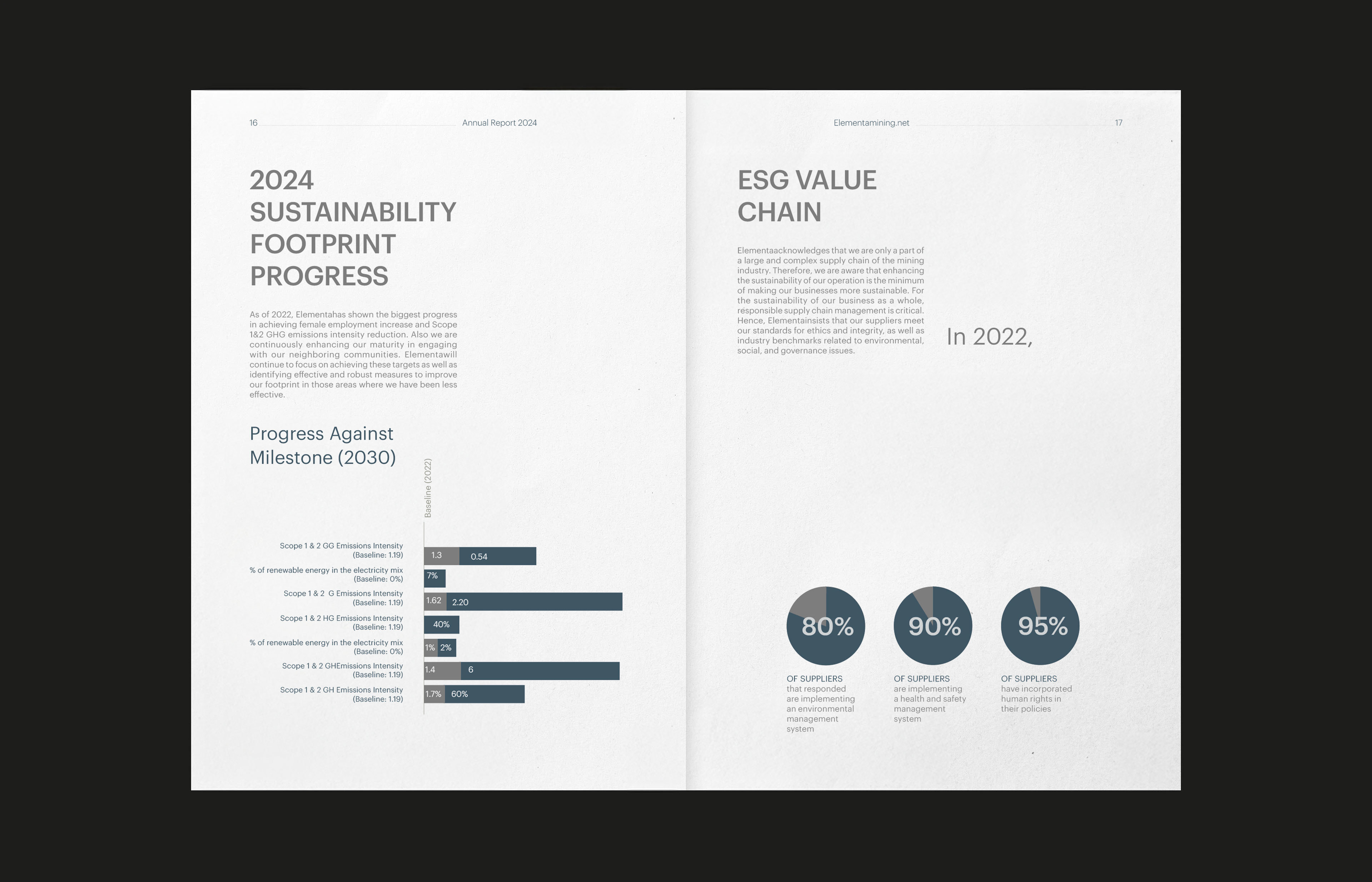
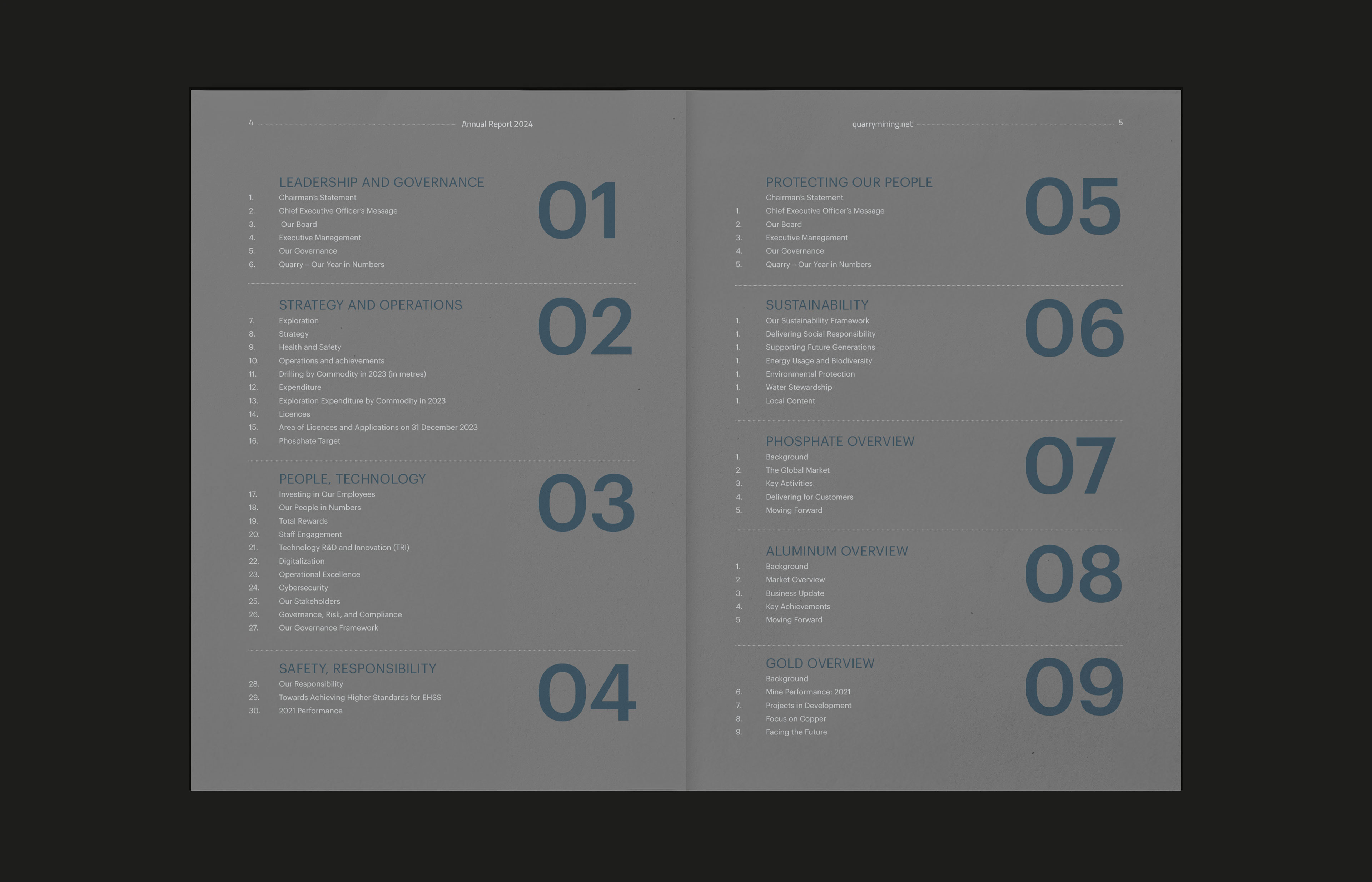
The layout system is modular and consistent, designed to handle large amounts of content without becoming heavy or difficult to navigate.
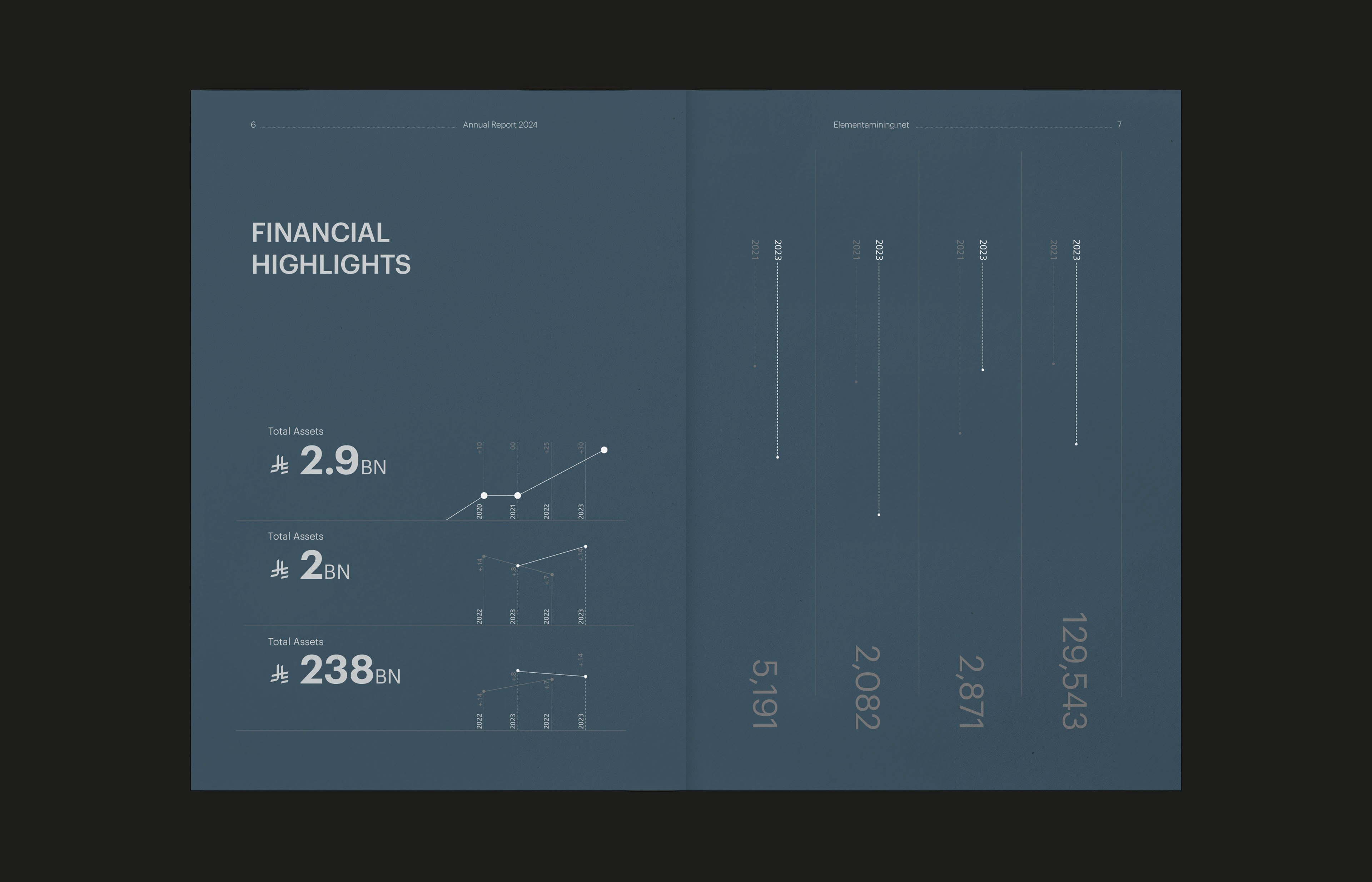
Spacing, alignment, and repetition create rhythm and familiarity. Section numbers and dividers guide the reader rather than decorate the page. Data is treated as central content, not as visual support.
This approach supports clarity and trust, which are essential in corporate and governance reporting.
–
Outcome
The result is an annual report concept that feels calm, credible, and considered. It avoids trends and visual noise, focusing instead on structure, responsibility, and long-term thinking.
Ultimately, the project is about showing how design can bring clarity and confidence to complex, regulated industries, without trying to impress or over-explain.
–